Leslie Larson: Lighting the Way

Originally posted August 19, 2019 on interiordesign.net

Leslie Larson, a Boston-based lighting designer and wood sculptor, began his 1964 disquisition “Lighting and its Design” with the observations that there were few well-designed lighting fixtures commercially available in America, and that architects too often neglected lighting design as an integral aspect of building. Larson himself designed both lighting systems and fixtures, and in his book, he makes a case for the importance of good lighting, and not incidentally, a good lighting consultant.

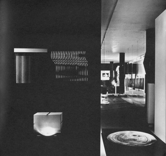
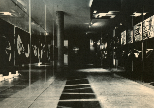
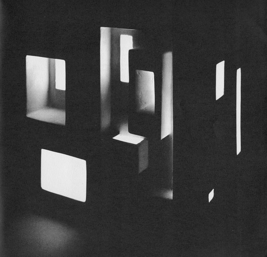
On a fundamental level, Larson points out that without light, form and space are not visible, and that the influence of light on the culture and psychology of man is too great for it to be treated mechanically. In short, lighting needs to be considered as a design problem, not an engineering one, and needs to be treated with specificity and with an awareness of both physiological and psychological needs. Beyond enabling the eye to function freely, a good lighting solution enlivens a space and addresses needs for excitement and repose, variety and even drama. Shadow and darkness, as well as natural and artificial light sources, are key elements for Larson–that the illustrations are all in black and white emphasizes this.

Larson provides numerous examples of buildings with well-handled lighting. These range from churches and cathedrals to auditoriums and offices–from the sacred to the profane. Ronchamp and the Guggenheim are singled out, neither surprisingly. Six projects caught my attention as good illustrations of Larson’s argument, and beautifully lit spaces:

1. The Vasterport Church in Vallingby, Sweden, architect Carl Nyren. Natural light coming from on high creates a spiritual aura, while the wall brackets add to the drama.

2. Dome over the Palazzo dello Sport in Rome, architect Paolo Nervi. Light and shadow define Nervi’s masterwork. By day, the brilliantly lit center recess is the focal point set against the softly lit radiating ribs. At night, the dark-lit pattern is reversed.

3. Interior of the Chase Manhattan Bank in Great Neck, New York, The Architects Collaborative. A humble space that is nonetheless crisply delineated by light and shade.

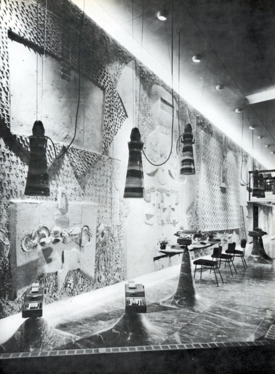
4. The Olivetti showroom, NYC, BBPR architects. The contours and textures of the sand relief mural by Constantino Nivola pick up light and cast shadows; the whole is vividly outlined by cushions of light. Note also the Venini hanging fixtures, which really beg to be seen in color.

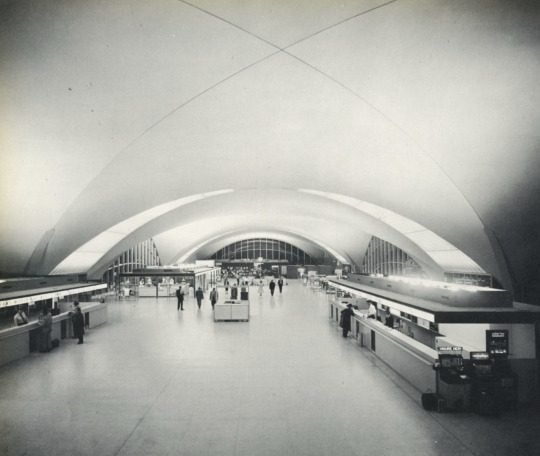
5. The St. Louis Air Terminal: Hellmuth, Yamasaki, and Leinweber, architects. Skylights at the junction points of the interlocking vaults provide natural light, while artificial lighting is placed above eye level. Light is projected upward at the surface of the vaulting, which becomes luminous in gradations.

6. Kresge Chapel, MIT: Eero Saarinen, architect, with Stanley McCandless, lighting consultant. An American Ronchamp, perhaps. Poetically lit with direct light from above, which filters downward via Harry Bertoia’s shimmering metal screen.

Light Reading: A 1965 Exhibition at Harvard

Originally posted June 18, 2009 on interiordesign.net

image

“Everything that is seen enters the human eye as a pattern of light qualities. We discern forms in space as configurations of brightness and color. The entire visible world, natural and man-made, is a light world. Its heights and depths, its majestic outlines and intimate details are mapped by light.” So stated Gyorgy Kepes in “Light as a Creative Medium.”

image
image

Hungarian-born painter, designer, educator, and art theorist Gyorgy Kepes (1906-2001) spent a large part of his career exploring and explaining light as a physical, cultural, and artistic phenomenon.  A student of Moholy-Nagy in Europe, Kepes went on to teach a workshop on light and color at the New Bauhaus in Chicago, and later at MIT. The 1965 exhibition he planned and designed at Harvard, “Light as a Creative Medium,” is thus a summation and continuation of 40 years of work. A stated aim of the exhibition was to trace the deep and deeply historical significance of light as a central tool of art.
“There is an age-old dialogue between man and light…Our human nature is profoundly phototropic. Men obey their deepest instincts when they hold fast to light in comprehensive acts of perception and understanding through which they learn about the world, orient themselves within it, experience the joy of living, and achieve a metaphoric, symbolic grasp of life,” Kepes continues.

image

The original language of this dialogue was fundamentally altered by the advent of the electric light, co-incident with the rise of cultural modernism and the modern city.

“In all major cities of the world, the ebbing of the day brings a second world of light…It is the world of man-made light sources, the glittering dynamic glow of artificial illumination of the twentieth-century metropolis…Washing away the boundary between night and day has lost us our sense of connection with nature and its rhythms. If our artificial illumination is bright and ample, it is without the vitality, the wonderful ever-changing quality of natural light. For the warm, living play of firelight we have substituted the bluish, greenish television screen with its deadening stream of inane images…”

image

This, of course, was a source of frustration to Kepes. Despite a quarter century of cultural preparation, modern artists still had not grasped the centrality or potential of light as a medium of art. As Kepes put it, artists were “afraid of light, the use of light, and the meaning of light.” This “spectrum of despair” corresponded with other perceived failures of the modernism project that were hashed out in the mid-1960’s, particularly in regard to the urban milieu. Against this backdrop of criticism and doubt, Kepes presented a call-to-arms to artists, designers, and architects, and offered a message of hope for the future: “This exhibition is a plea…for an emerging environmental art: the creative management of light…It is an art of enormous promise. For painters, sculptors, and makers of motion pictures, a field for creative originality…For architects and planners, a mighty tool with which to reshape our tangled, cluttered cityscapes. For the ordinary citizens of our dizzily expanding urbanized world, an aid to orientation in their surroundings.”

image
image

Author’s note: In 1964, at the same time that “Light as a Creative Medium” was being organized, a young artist mounted two exhibitions in New York City galleries. Dan Flavin’s first exhibition in fluorescent light, at the Green Gallery, addressed Kepes’ plea for a “radiant new visual poetry” and marked a watershed in the advent of 1960’s minimalist art. In the context of the Harvard exhibition, it is interesting that the minimalist movement was directly influenced by this use of light and color.

Images 1-4 from the catalog “Light as a Creative Medium” published by Harvard University in 1965; image 5 by Bernice Abbott in “Language of Vision” by Gyorgy Kepes; image 6 by Billy Jim, courtesy of Stephen Flavin; image 7 courtesy estate of Dan Flavin.

Barbier-Mueller at the Met

Originally posted June 11, 2009 on interiordesign.net

Let’s start with the good news: “African and Oceanic Art from the Barbier-Mueller Museum, Geneva: A Legacy of Collecting,” running through September 27 at the Met, is a show well worth seeing. The exhibition features 36 works—all masterpieces—from one of the world’s great private art collections. Begun by Josef Mueller (1887-1974) in the 1920’s, and continued by his son-in-law Jean-Paul Barbier-Mueller, the collection was placed on permanent display in 1977. The works on view range across a wide swath of Africa and the South Pacific, and they brilliantly demonstrate the virtuosity and formal inventiveness of individual creative talents.

Now for the not-so-good news: from the title to the installation to the catalog photography, the exhibition raises issues, or at least fails to resolve concerns, which make it difficult to absorb the magnitude of the works presented. Putting “A Legacy of Collecting” in the title forces us to consider the ramifications of collecting at a moment when ethnographic art is coming under the same scrutiny as the art of antiquity. The legacy of collecting ethnographic art is increasingly being discussed as a legacy of inappropriate or questionable acquisition, if not outright looting of cultural patrimony.

While this is a complex issue, particularly in legal nuance—the UNESCO Convention of 1970 only went into effect in Switzerland in 2005, and is not retroactive—it is also a concrete and politically charged issue. A cursory internet search of “Barbier-Mueller Museum” reveals a dialogue of protest, aimed directly at the Barbier-Mueller holdings of excavated terracotta figures, but also at the depletion of African cultural artifacts in general. One such broadside, written by Dr. Kwame Opoku, spells out the damage caused by alienating tribal objects from the fabric of context, and makes a reasoned and measured claim on our collective sense of fairness.

The installation of the Barbier-Mueller pieces at the Met does little to dispel the echoes of pleas such as these. The monumental, neoclassical space which forms the backdrop, tied to the Rockefeller name, only underscores the colonial power inequities at the center of contention. The installation itself, with the objects inaccessible and captured behind glass or in glass boxes on pedestals, along with the catalog photographs of isolated objects set against solid but empty backgrounds, serve Western eyes and sensibilities at the expense of African and Oceanic notions of context and meaning.
In a review for the New York Times last week, Holland Cotter argued that the Barbier-Mueller exhibition puts notions of “primitive” to rest and tells us that African art is not a fixed set of forms repeated verbatim, but an art of specificity and individuality. While this may be so, the same can be said of the 1996 Guggenheim exhibition “Africa: The Art of a Continent,” which made these points on a much larger scale—some 500 objects—and a more conducive stage (Frank Lloyd Wright’s idiosyncratic and expressive building).

Perhaps it is time for museums to move beyond polemics on these two points—primitivism and traditional invariance—and to more fully and directly engage the pressing topical matters of context and repatriation. As with green design, this genie is not going back in the bottle, and museums that ignore or under-represent the African perspective in tribal arts exhibitions will appear increasingly retrograde and arrogant. Go to the exhibition at the Met to see these masterpieces of art, but recognize that the Met is something of a museum of Western museology.

If you are inspired and engaged by ethnographic art, as I was at the Guggenheim show, I recommend reading any catalog published by the Museum for African Art, and patronizing that museum when it re-opens on 5th Avenue and 110th Street.

From top: Power figure, Nkisi, Democratic Republic of Congo, 18th-19th century, courtesy of the Metropolitan Museum of Art; mask, Torres Strait, Saibai Island, 19th century, courtesy of the Metropolitan Museum of Art; Josef Mueller, circa 1967; kneeling male figure, Mali, 14th-16th century, courtesy of the Metropolitan Museum of Art; male figure, Easter Island, early 19th century; female figure, northern Angola, Shinji, 19th century, courtesy of the Metropolitan Museum of Art; Barbier-Mueller Museum Canoe prow ornament, Solomon Islands, in case, photo by Larry Weinberg; Poro female figure, Cote d’Ivoire, Senufo, 19th century, courtesy of the Metropolitan Museum of Art; funerary figure, New Ireland, 19th century, courtesy of the Metropolitan Museum of Art.

Re-Thinking Saarinen: A New Eero

Originally posed June 4, 2009

Eero Saarinen (1910-1961) was the subject of a symposium Tuesday night at the Museum of the City of New York. The symposium was a benefit preview for the traveling exhibition, Eero Saarinen: Shaping the Future, which is scheduled to come to New York later this year. If the benefit is any indication, the exhibition will indeed make it here, as well it should given that Saarinen’s works have been part of the fabric of the city for half a century. Still, nothing should be taken for granted, and anyone interested in supporting the Museum directly or with fundraising ideas should contact the Museum director, Susan Henshaw Jones.


Surprisingly, given his resume and pedigree, this is the first retrospective exhibition of Saarinen’s work. It is also the first scholarly study to make use of newly available archival materials.   Through the exhibition and its accompanying catalog, the participating curators and writers hope to contextualize and reassess the full range of Saarinen’s output, and to burnish Saarinen’s reputation, which had been tarnished by criticism and neglect.

Fittingly, Vincent Scully’s essay, “Rethinking Saarinen” was placed at the front of the catalog. Scully, an eminence grise among architectural historians, was among Saarinen’s harshest critics (this list included Reyner Banham and Manfredo Tafuri). At the time, Saarinen was deemed an apostate and even a liability, a deviant from the true path of modernism that seemed to lie, in America, with Louis Kahn and Robert Venturi.

Scully does not retract his criticism—he saw things how he saw them—but time has softened his views. With hindsight, Saarinen’s exuberant shell structures seem less a self-indulgent dead end than a precursor to the computer-aided free-form architecture of Calatrava, Hadid, and Gehry. More pointedly, Scully now views the TWA terminal as a mediating and comforting portal between two sets of traveling tin cans, and in general acknowledges that Saarinen was more directly concerned with human use and meaning than he realized.

Seen in this way, Saarinen appears less a romantic than a humanist, his flights of individual imagination and fancy tempered by aesthetic restraint and teamwork, his designs grounded in real physical and emotional needs. In his own writings, collected in a 1962 book by his wife, Aline, and again in the present catalog, Saarinen indeed showed a measured and balanced aesthetic sensibility. Inclined to conquer gravity and soar—to create non-static, dynamic space—when the program permitted, he yet was keenly aware of the possibility of going too far. “Technology,” he stated in 1957, “has made plastic form easily possible for us. But it is the esthetic reasons which are the driving forces behind its use…The choices really become sculptor’s choices. But we must be aware of going too far…Plastic form for its own sake, even when very virile, does not seem to come off.”

As the press release describes it, Eero Saarinen: Shaping the Future is a comprehensive project exploring the work of one of the most prolific, unorthodox, and controversial masters of 20th-century architecture. Jointly presented by the New York Design Center, the exhibition is scheduled to open November 10 at the Museum of the City of New York. For its New York run, the show will feature a number of expanded sections, notably involving the interiors of the CBS building and the Vivian Beaumont Theater. Mark your calendars, and please consider supporting the Museum in bringing this exhibition to the city.

Images from top: Cover of catalog, Yale University Press, 2006; Eero Saarinen, photo courtesy of NPS.gov; sketch of Ingalls Hockey Rink, Yale, circa 1953, courtesy of Eero Saarinen Collection, Yale University; patent drawing of Tulip chair, 1960, courtesy of Saarinen Collection, Yale University; Kresge Chapel, Massachusetts Institute of Technology, courtesy of Ed Brodzinsky/Flickr; TWA Terminal, Kennedy Airport, circa 1962, photo by Balthazar Korab.

Second Glass: The Industrial Design and Architecture of Henry P. Glass

Originally posted May 7, 2009 on interiordesign.net

I posted last week about Henry Glass’s furniture designs. This week, I’m going to look at his industrial design and architecture, or at least at sketches thereof. In perusing his self-published catalog of 1970—his portfolio, actually—I responded time and again to fanciful and often boldly colored proposals for designs and structures that likely never went into production. More than this, that never stood a chance of going into production, and can best be classified as romantic or utopian. I suspect that Glass felt the same way I did about these projects—he featured them in his portfolio, after all—and I’d guess they provided him with an ongoing source of intellectual and creative nourishment.

For all his interest in mechanisms and modules, and for all his rationalist theory, Henry Glass had a fertile and vivid design imagination, and was given to flights of expressive visual fancy. How do we characterize the visual aspect of his sliding ponds and phone booths, his cars and jungle gyms? By and large, they are biomorphic, fluid, curvilinear, colorful, and visionary. They convey a sense of plasticity and malleability, and hence of possibility. They appear people-friendly and optimistic. The word “imagineering” comes to mind—some Disney-esque combination of imagination and engineering; this was Glass’s work zone, and the Disney reference may not be far-fetched given the range of children’s furniture and playground equipment he designed.

Glass’s architectural thinking is a direct extension of his design thinking (or vice-versa—Glass trained as an architect in Vienna, though he was never licensed here).  Once again, in looking through his catalog, I was drawn to unrealized sketches more so than to built structures. Glass showed an early interest in pre-fabricated, factory-produced housing, an interest directly related to his modular furniture designs. The 1944 sketches for Interiors Magazine are reproduced here. The freeform styling of the rendering in itself suggests a core concern with people—human scale, biomorphic shape, and an organic relationship between people and the environment.

Glass’s 1969 apartment building proposal depicts box-like shapes more conducive to fabrication. That Glass was still planning pre-fabricated housing in the late 1960’s, when few other Americans were, shows a sustained and admirable commitment to working out ideas he deemed important. Note also the model for the collapsible aluminum shelter, an architectural analog to his fold-up, knock-down furniture designs.


Glass produced something on the order of 20,000 drawings during his career. This is a prodigious output that bespeaks a passionate discipline for the process of designing. Some of these drawings have been sold through Architech Gallery in Chicago, which represents the Glass estate. Many of Glass’s design ideas, as well as the forms that expressed them, were simply out of step with commercial realities and prevailing tastes. To his credit, Glass kept drawing. That a number of his abiding concerns—pre-fabrication, modularity, affordability, waste, ecological responsibility—are now topical suggests that Glass’s legacy, as embodied in his drawings, is due for re-evaluation, and for belated recognition of cultural relevance.

From top: Moulded phone booth sketch for Gladwin Plastics, 1966; study in factory produced modular housing for Interiors Magazine, 1944; suburban car proposal for Science and Mechanics, 1951; metal fireplace sketch for Technology/Welded Products, 1967; pre-fab metal slide sketch for Miracle Equipment Co., 1969; sketch for pre-fab modular apartment for Mobile Homes Mfg, 1969; Accordium folding mobile shelter for ALCOA, 1960. All images from the Henry P. Glass Association catalog.