60s

Circular Reasoning: On the Geometry of Chairs

Originally posted November 24, 2010 on interiordesign.net

Beginning with de Stijl, geometry became an obvious metaphor for the scientific and mechanistic modes of thinking associated with avant-garde modernism. Mondrian’s canvases, arguably influenced themselves by Frank Lloyd Wright’s Prairie School architecture, became templates for mid-century wall systems and modular case good systems, as well as graphic inspiration for architecture.

All of these applications self-evidently involved rectilinearity or at least linearity–the so-called deconstruction and reconstruction of the box, applied both to surface and volume. Famously, this was the approach taken with Rietveld’s Red and Blue chair, which was explicitly linear, a rigid composition of wooden planks designed with little regard for comfort. Much cantilevered, Bauhaus-inspired furniture would also fit into this camp, though with somewhat greater interest in comfort. In the opposing, organic camp, are chairs such as the Womb chair, ergonomic in character, curvilinear, and fitted to the human form.

The circle occupies a place somewhere in between though much closer to the geometric camp; in Platonic terms, the circle is perfect, the ultimate geometric symbol of wholeness, unity, infinity. With tables, there is a long tradition of circular design: the Knights of the Round Table, round table discussions, etc. (note the underlying egalitarian aspect of this shape–no one sits in a privileged position).
Though curvilinear, the circle does not suggest itself for chair design–people have curves but are not hemispheric or conical, at least generally speaking. A circular or spherical chair is not inherently ergonomic, though it can be rendered comfortable with slings, padding, pillows, or butt-shaped indentations. Partly for this reason, and likely for technical reasons also, relatively few chair designs hewed to the geometry of the circle. And those that did tended to have an agenda: either experiments in form or ideological or symbolic statements of some type.
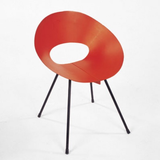
Beginning in the early 1950’s, the circle was deployed in chair design in the work of Donald Knorr, Lina Bo Bardi, and Roberto Mango. Knorr’s chair, shaped from a ribbon of sheet metal, shared first prize in a 1950 MoMA Low-Cost Furniture competition. Distributed by Knoll, and painted red, yellow, or black, with black metal legs, the chair possessed a minimalist and elegant beauty. Intended to be comfortable, the chair was also offered in a padded version, just in case. Bo Bardi, the Italian/Brazilian architect and designer, contributed an eye-catching chair consisting of a hemispheric seat floating inside a round tubular metal base. The chair could be used parallel to the ground or at an angle, for a variety of seating or lounging positions. The image here, which uncropped shows two such options, is from the cover of an Interiors magazine from the early 1950’s. It is notable, and surely meaningful, that Bo Bardi is a woman designer and the circle is a female archetype. Unlike Knorr and Bo Bardi, the Mango chair illustrated here is made of wood–in this case shaped plywood–and it looks like a James Prestini bowl on legs. This chair is part of a series done by Mango in wood and metal, exploring the possibilities of the circle as a chair frame. Significantly, all the designs referred to here had one thing in common: a lack of commercial success, and hence a small production run.

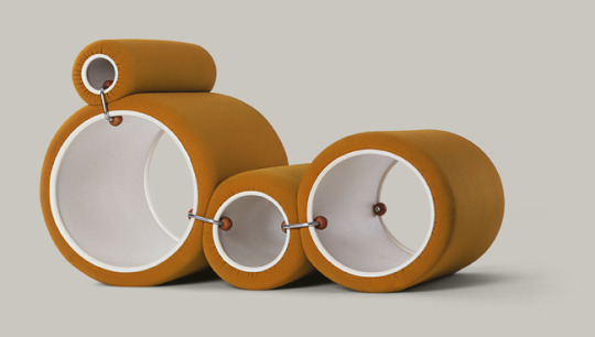
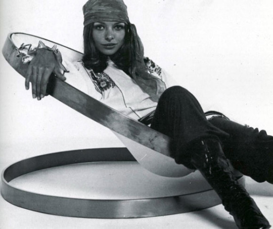
Continuing this tradition were three circular chair designs from the late 1960’s. In the case of Arman’s 1969 chair for Atelier A, consisting of two steel rings with a leather sling, the intent was not serial production but design/art; more a functional sculpture than a seating solution. Joe Colombo’s 1969 Tube chair for Flexform cleverly used round tubes looking like paint rollers to achieve a variety of seating options. Despite advertisements pointing to the comfort obtainable through the flexibility of assembly, the chair was far too radical for prevalent taste cultures.
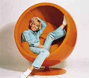
Somewhat more accessible, and commercially viable, was the work in plastic by Finnish designer Eero Aarnio. His Pastille chair of 1967, with its contoured seating indentation, took the circle in an ergonomic direction, while his Ball chair of 1969, shown here and based on a sphere, required cushions and pillows to suggest comfort. The Ball chair stood, and stands, as a production analog to the utopian 1960’s preoccupation with self-contained living environments.

While this is not an exhaustive list of post-war circular chair designs, the two clusters around 1950 and 1969 do suggest an underlying cultural rationale at those moments—some metaphoric or symbolic reason for this attraction to the circle.  A topic I will deal with when I get around to it…

‘The Jetsons’ on the Drawing Board

Originally posted September 30, 2010 on interiordesign.net

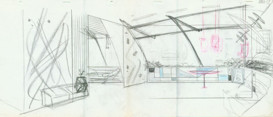
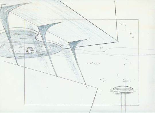
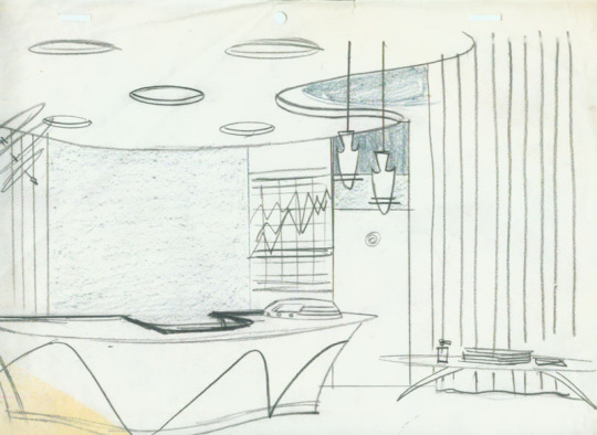
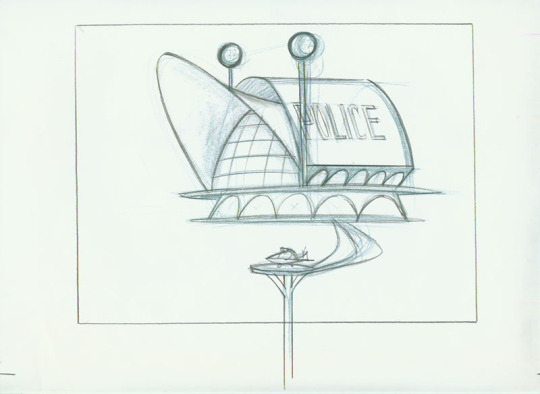
From time to time I look online for still images of “The Jetsons” interiors for a post about cool futuristic design in animated TV sitcoms. Sooner or later, I’ll rent the DVD of the first season and photograph selected frames. Yesterday, though, I came across a website devoted to the animation art of Irv Spector, put up in 2008 by his son, Jay.

Irv worked for Paramount and Hana-Barbera, and one of his assignments was to do background and character studies for the first season of “The Jetsons.” For anyone growing up in the 1960’s, the show was a must-see, a futuristic version of “The Flintstones,” which was itself an animated variation of “The Honeymooners.”

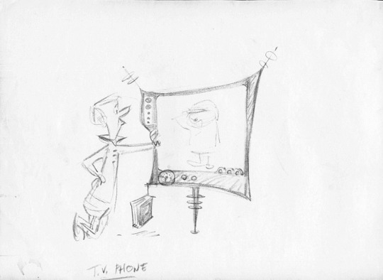
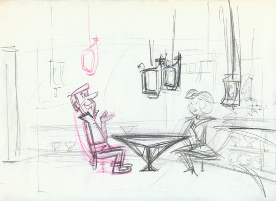
Premiering in September 1962 on Sunday nights on ABC, “The Jetsons” had an initial run of 24 episodes, ending in March 1963 (it would be resurrected for another 50 episodes in the 80’s). Thanks to serialization, “The Jetsons” had a cultural impact beyond its short run-“that’s so Jetsons” is still a pejorative way to describe postwar design. Yet, as the renderings shown here demonstrate, the creative vision behind the program had much on the ball in terms of architectural and design savvy.

Among Irv Spector’s papers was a drawing of Saarinen’s TWA terminal-to Jay Spector a clear indication of the primary source of inspiration. The other source mentioned on discussion boards is the Seattle Space Needle. Both structures are clearly visible in the parabolas, swooping arcs, soaring arches, and freeform shapes of Irv’s drawings-the police station is a miniature TWA terminal; the tower on the right, a version of the Space Needle. I especially like the first three renderings, sans George and Jane-these look like architectural or interior design proposals from a leading early 60’s firm, more Oscar Niemeyer, even, than Morris Lapidus (sorry, Morris).

Surely, the vision of the future presented in the Jetsons owes much to 50’s architectural and design practice-this, after all, was the “googie” decade, the era of Las Vegas and Miami. But it is worth noting that both the TWA Terminal and the Seattle Space Needle opened in 1962, just as “The Jetsons” came on the air. This sort of aesthetic synchronicity is rare in movies or TV; just look at “Men in Black,” where the futuristic furniture was designed in the 50’s and 60’s. Even Morgue’s Djinn series came out three years before “2001” aired. So people watching “The Jetsons” in 1962-and given the Sunday-night time slot, this likely included as many adults as children-were absorbing utterly contemporary interior design and architectural references that conveyed futurism in their moment (“The Jetsons” was set in 2062) and still continue to do so.

As for the gadgets and gizmos, that is another story, but have a look at the flat-screen TV/video phone shown here. Thanks, Jay, for sharing your father’s work.

Re-Thinking Saarinen: A New Eero

Originally posed June 4, 2009

Eero Saarinen (1910-1961) was the subject of a symposium Tuesday night at the Museum of the City of New York. The symposium was a benefit preview for the traveling exhibition, Eero Saarinen: Shaping the Future, which is scheduled to come to New York later this year. If the benefit is any indication, the exhibition will indeed make it here, as well it should given that Saarinen’s works have been part of the fabric of the city for half a century. Still, nothing should be taken for granted, and anyone interested in supporting the Museum directly or with fundraising ideas should contact the Museum director, Susan Henshaw Jones.


Surprisingly, given his resume and pedigree, this is the first retrospective exhibition of Saarinen’s work. It is also the first scholarly study to make use of newly available archival materials.   Through the exhibition and its accompanying catalog, the participating curators and writers hope to contextualize and reassess the full range of Saarinen’s output, and to burnish Saarinen’s reputation, which had been tarnished by criticism and neglect.

Fittingly, Vincent Scully’s essay, “Rethinking Saarinen” was placed at the front of the catalog. Scully, an eminence grise among architectural historians, was among Saarinen’s harshest critics (this list included Reyner Banham and Manfredo Tafuri). At the time, Saarinen was deemed an apostate and even a liability, a deviant from the true path of modernism that seemed to lie, in America, with Louis Kahn and Robert Venturi.

Scully does not retract his criticism—he saw things how he saw them—but time has softened his views. With hindsight, Saarinen’s exuberant shell structures seem less a self-indulgent dead end than a precursor to the computer-aided free-form architecture of Calatrava, Hadid, and Gehry. More pointedly, Scully now views the TWA terminal as a mediating and comforting portal between two sets of traveling tin cans, and in general acknowledges that Saarinen was more directly concerned with human use and meaning than he realized.

Seen in this way, Saarinen appears less a romantic than a humanist, his flights of individual imagination and fancy tempered by aesthetic restraint and teamwork, his designs grounded in real physical and emotional needs. In his own writings, collected in a 1962 book by his wife, Aline, and again in the present catalog, Saarinen indeed showed a measured and balanced aesthetic sensibility. Inclined to conquer gravity and soar—to create non-static, dynamic space—when the program permitted, he yet was keenly aware of the possibility of going too far. “Technology,” he stated in 1957, “has made plastic form easily possible for us. But it is the esthetic reasons which are the driving forces behind its use…The choices really become sculptor’s choices. But we must be aware of going too far…Plastic form for its own sake, even when very virile, does not seem to come off.”

As the press release describes it, Eero Saarinen: Shaping the Future is a comprehensive project exploring the work of one of the most prolific, unorthodox, and controversial masters of 20th-century architecture. Jointly presented by the New York Design Center, the exhibition is scheduled to open November 10 at the Museum of the City of New York. For its New York run, the show will feature a number of expanded sections, notably involving the interiors of the CBS building and the Vivian Beaumont Theater. Mark your calendars, and please consider supporting the Museum in bringing this exhibition to the city.

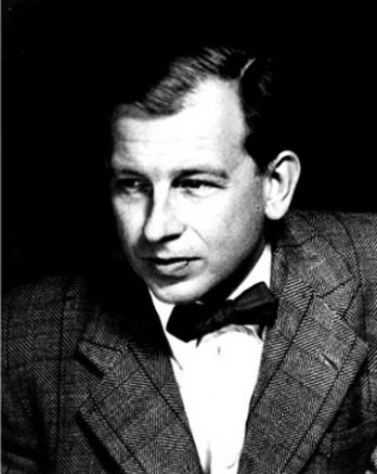
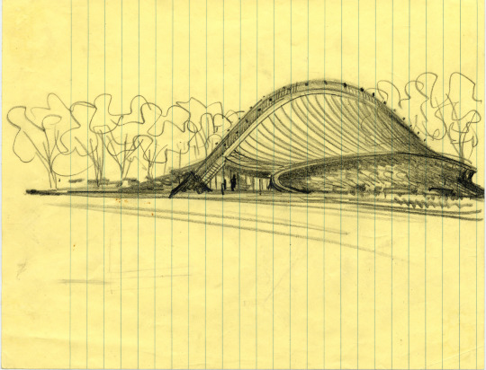
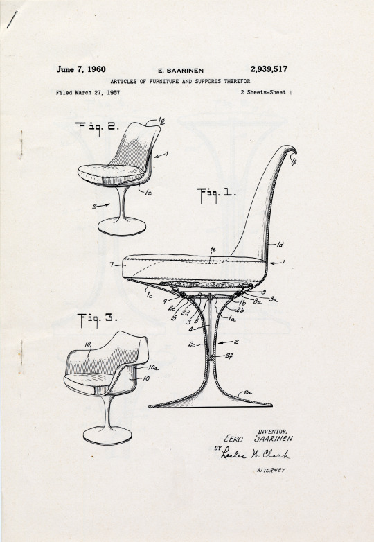
Images from top: Cover of catalog, Yale University Press, 2006; Eero Saarinen, photo courtesy of NPS.gov; sketch of Ingalls Hockey Rink, Yale, circa 1953, courtesy of Eero Saarinen Collection, Yale University; patent drawing of Tulip chair, 1960, courtesy of Saarinen Collection, Yale University; Kresge Chapel, Massachusetts Institute of Technology, courtesy of Ed Brodzinsky/Flickr; TWA Terminal, Kennedy Airport, circa 1962, photo by Balthazar Korab.