Modern Venetian Handicraft

Originally posted April 22, 2010 on interiordesign.net

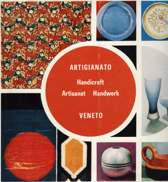
Last week (2010), Venice hosted a Design Leadership Summit that brought together a few hundred design leaders from the United States to discuss things that design leaders discuss. I was not invited, nor did I get a T-shirt. I did, however, find a book (in Brooklyn) called “Artigianato Veneto,” or Venetian Handicraft. Published in 1971, the book showcased recent work in fields such as glass, metal, ceramics, jewelry, wood, lace, printing, and textiles, while also tracing the traditions and history of these crafts as practiced in Venice.

The timing of the book suggests a civic purpose in terms of celebration and promotion. Being planned at the time was the seminal exhibition of Italian design to be held at MoMA in 1972 under the title “Italy: The New Domestic Landscape.” More to the point, held the year before, in 1970, was an exhibition in Milan called “Milan 70/70” that was both a retrospective of a century of design in Milan and a celebration of a decade that elevated Milan to the center of the design universe. For all its glorious craft traditions and modernist achievements, Venice was probably feeling like a second city, and “Artigianato Veneto” was probably an attempt to redress this imbalance while promoting Venetian crafts to the world (the text was printed in English, French, and German, as well as Italian).

Tradition and history are a source of civic pride, and the region around Venice, which includes Verona, Padua, and Murano, has a rich history of artisanship, manufacture, and trade. These histories are referenced for each of the crafts discussed, but the thrust of the book is forward-looking, toward the mid-20th century and beyond. How else could Venice respond to Milan’s indisputable leadership in conceptual, utopian, and anti-design? How else to compete with Joe Colombo, Vico Magistretti, Gae Aulenti, Achille Castiglioni, Flos, Artemide, and Kartell, but with a handicraft rooted in a glorious past yet creating a sort of beauty organically linked to the present? It is worth noting that plastic—both symbol and medium of 60’s avant garde Italian design—is not even mentioned in “Artigianato Veneto.”

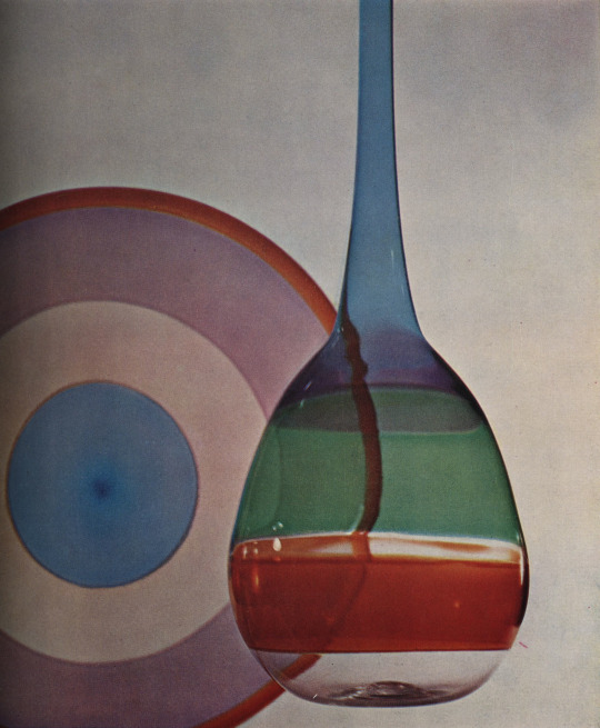
What is mentioned, and what occupies the largest section of the book is, of course, glass from Murano. The catalog here shows masterworks of modernist glass in both technical and artistic capacity. Richly illustrated with works by Venini, Barovier, Seguso, Toso, Vistosi, Salviati, Barbini, and Martinuzzi, the glass section alone commends Venice to the attention of modern design enthusiasts, though the greater works are of mid-century rather than late 60’s origin. Shown here are vessels by Aureliano Toso and colorful turkeys by Venini.

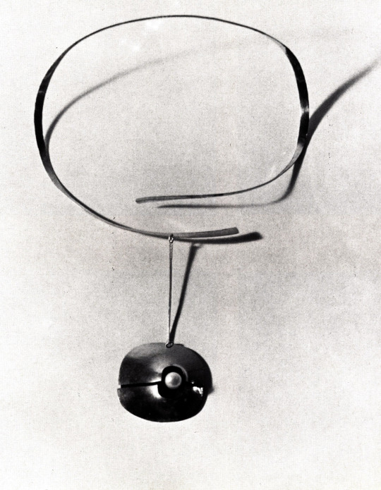
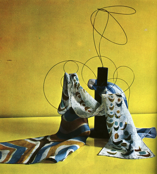
Beyond glass, the book shows children’s furniture in wood by Gigi Sabadin, pottery and ceramics “in modern shapes” by Gastone Primon and Marisa Sartoretto, and a ceramic sculpture by Federico Bonaldi, very much in a late 1960’s idiom. Still, it is the metal work that catches the attention as the region’s second most interesting modernist craft. Padua shares the spotlight here with Venice, as it was home to Paolo de Poli, the enamalist who collaborated with Gio Ponti on a famous series of enameled animals, pictured here. Also shown is a fretwork silver vase by Andreina Rosa, a mirror with a zinc and lead frame from Artigiano Peltro, and a gold necklace by Atelier des Orfevres. Thrown in for good measure is a vignette of scarves by Tiziana Carraro.

Forty years later, the 60’s design from Milan remains conceptually compelling and, not incidentally, marketable. The best work produced in the Venetian region during this period, if less radical, still looks important and fresh, and as for marketability, I see a trip to Venice in my future. Hear that Leadership Committee?

Goldfinger on British Design

Originally posted April 8, 2010 on interiordesign.net

Sorry, that would be Erno, not Auric. Born in Hungary, the modernist architect and furniture designer Erno Goldfinger (1902-87) moved to Paris in 1921, where he fell under the sway of Perret, Mies, and Le Corbusier. He moved to London in 1934 after marrying Ursula Blackwell, heiress to the Crosse and Blackwell fortune. The modernist scene Goldfinger encountered in Britain was conservative and stodgy compared to America and continental Europe. Sans Gropius, Breuer, and Chermayeff, all laid over in England pending transit to America, it might even have flatlined (apologies to Welles Coates and Betty Joel).

A comparison of “The Studio Yearbook,” a British publication, and “Domus,” the Gio Ponti-edited Italian publication, bears this generalization out visually. So too does the direction of the modern design market. In furniture and lighting design, at least, technical, stylistic, and conceptual innovation apparently skirted the British Isles. The Festival of Britain, held in 1951—exactly one century after the Crystal Palace Exhibition—was, like its predecessor, both an acknowledgement of cultural deficiency and a concerted effort to improve the situation.

Still, it would be polemical to call early postwar British design moribund. Erno Goldfinger’s “British Furniture Today” was published in 1951, and it shows a pulse to British modernist design prior to the impact of the Festival. Goldfinger reserved the cover for his own table, but whatever his merits as a designer—and I like the table on the cover—he was a perceptive and discriminating editor. His small and slim volume (5 inches by 7.5 inches by .5 inches) includes future icons by Ernest Race (the Antelope chair) and Robin Day (the so-called Festival chair), as well as the Saarinen-inspired shell chair by Dennis Young, Breuer’s plywood lounge for Jack Pritchard’s Isokon, the popular Stack-A-Bye chair of tubular steel and sheet metal, and the unit case series by Robin Day and Clive Latimer that won first prize in a 1950 MoMA low-cost furniture competition.

The value of Goldfinger’s book lies beyond these touchstones, however. A high percentage of the examples in the admittedly short book show what I would regard as dynamic and even edgy modern design. Goldfinger’s text, oriented toward rational, ergonomic, low-cost, mass-produced precepts (note that Goldfinger was commissioned to design offices for the Daily Worker newspaper and the British Communist Party headquarters) belies the expressive, joyously sculptural character of many of his selections.

Among the little-known pieces of avant-garde modernism identified by Goldfinger are the following, illustrated here: a radically curvilinear lounge chair with cutaway arms that channels Finn Juhl or Carlo Mollino by Neville Ward and Frank Austin; a slightly less radical wing chair in tune with the just-published work of Vladimir Kagan; an elegant and progressive-looking adjustable reclining chair, maybe Royere meets Kagan, by Clive Entwhistle for Design Research Unit; a demountable wooden chair along organic design principles by the design group Arcon; a garden seat in wood by the design historian and theorist David Pye (subject of a future post) that resembles the tradition-inspired modernist work of Charlotte Perriand or Clara Porset; a graphically interesting, Knoll-looking sideboard on hairpin metal legs by Ian Bradbury; and a stabile-like adjustable floor lamp by B.M. Schottlander.

Unfortunately, the pieces illustrated here, as well as most of the other interesting pieces shown by Goldfinger, failed to reach a large audience. I can’t think of many examples on the market today or even in the past decade. Perhaps more exposure to these pieces would lead to a renewed appreciation for early postwar British design. As it is, Goldfinger’s book points to the presence of young design talent in England, and provides a snapshot of a nascent cultural flowering, even if that flowering wasn’t realized until the mid-1960’s.

For the record: after a conversation on a golf course with a cousin of Ursula Goldinger’s, Ian Fleming named his Bond nemesis. Erno was not amused.

Dona Meilach on Modern Wood Furniture

Originally posted January 28, 2010 on interiordesign.net

Dona Meilach (1926-2008) was a seemingly indefatigable connoisseur, champion, and chronicler of craftsmanship. All told, she wrote over 40 books and several hundred articles on a broad range of craft topics and techniques. A glimpse at some of the titles—“Creating Art from Fibers and Fabrics,” “Creating With Plaster,” “Papercraft,” “Collage and Assemblage,”—speaks to the encyclopedic breadth of her interests, as well as the depth of her knowledge: she not only studied but also performed the crafts she wrote about.

Her tactile, scholarly, and catholic approach enabled her to deeply understand the craft movements of her era (1960-80’s), and to grasp the tendencies and elements that were significant and innovative. In my library, I have three of Meilach’s books: “Contemporary Art With Wood” (1968); “Creating Modern Furniture” (1975); and “Woodworking, the New Wave”(1981). Along with “Creating Small Wood Objects as Functional Sculpture” (1976), these works form as good an introduction to postwar craft woodworking as exists. Part how-to guides, part visual encyclopedia, these books provide both detailed technical information and lavishly illustrated curatorial information.
“Creating Modern Furniture” is the focus of the present post. Subtitled “Trends, Techniques, Appreciation,” it provides an overview of the craft woodworking movement of the mid-70’s, featuring 580 photographs, mostly of works by a multitude of American artisans. The first part of the book describes woodworking techniques and praxis, including sawing, sanding, grinding, joining, gluing, finishing, and veneering. Trees, wood, lumber, tools, and even work area and safety are discussed.

As interesting as this is, the book’s value lies in the examples that are shown—Meilach had a truly great eye for innovation and beauty. With hindsight, the book contains work by the usual suspects, who may or may not have been usual suspects at the time.

This list includes Michael Coffey, Gary Knox Bennett, Jack Rogers Hopkins, J.B. Blunk, Wendell Castle, Mabel Hutchinson, Jere Osgood, George Nakashima, Wharton Esherick, and John Makepeace. The standout here for me is Jack Rogers Hopkins, a California artisan who worked in laminated, steam-bent woods. I’ve included an image of an installation with a grandfather’s clock and a dining table, and a close-up of the dining table, which to me is the most stunning object in the book. Meilach cites Hopkins for virtuosity, and notes that the interaction of the various wood colors in the table (teak, maple, and birch are used) adds to the total sculptural concept.

Beyond the dozen or so artisans who have become household names in the design market, there are a few dozen more with similar talent, and here the book becomes a guide to future collectability. A few of the more eye-popping works, shown here, include a low table of African Padouk wood by Joe Barano (“a marvelous interplay of sculptural forms”); a coat tree and lounge chair by Edward Livingston; a double love seat of fir by Robert Dice; a “Clam” chair of walnut with fur and leather interior by Edward Jajosky that closes on itself; and a door by sculptor and jewelry designer Svetovar Radakovitch that includes surprises such as inset chunks of colored glass and cast bronze hinges. As striking as these pieces are, they do not even figure in the chapter “Fantasy Furniture,” which includes a surreal-looking chest of drawers in a mélange of woods by Denis Morinaka and a cabinet with doors-within-doors by Ann Maimlund, both pictured here.

The Brief but Notable Career of Gordon Drake

Originally posted October 22, 2009 on interiordesign.net

image

When Gordon Drake died while skiing at age 35 in 1952, he accidentally ended an architectural career that was as meteoric as it was brief.  In seven years, he completed a scant dozen or so buildings, but his first two won national recognition in architectural competitions, and his reputation was such that his buildings, sketches, and writings influenced the postwar built environment, and inspired a book, “The California Houses of Gordon Drake,” published in 1956.

image

Born in Texas, Drake served in the Marines during WWII and moved to the West Coast when discharged.  More than anything else, Drake was a California designer, working out his ideas with respect to local climate, topography, lifestyle, and mindset.  As he noted at the beginning of his career, “the dominant factor in the development of California’s domestic architecture has been the…lack of a stifling formal tradition. The resulting freedom of thought has given the architect an untrammeled concept that does not exist in other parts of the country.”  Drake’s contribution to this concept was a vision of the small house, artfully sited in nature, well suited to indoor-outdoor living, and affordable.

image

Like many mid-century designers, Drake’s first project was done for himself, and at low cost.  Completed in 1946, the Drake house in Los Angeles won first Prize from Progressive Architecture in a competition aimed at raising contemporary standards for residential living.  An editor noted, “Seldom does one see work in which structure, site, and clients’ needs merge so completely in the process of design.” Recognition was also given to Drake’s next project, the Spillman House (also in LA), which won second prize in House and Garden’s 1947 Award in Architecture.

image

Drake’s first houses served as a template for his subsequent work in terms of the liberal use of timber and plywood, in the centrality of light as a design element, in the integration of natural beauty with structure, and in the simple, modular construction methods. Wood was prevalent in California, and inexpensive.  Drake favored rough-hewn boards on the outside for form and texture, set off against the “magnificent sophistication of waxed plywood on the interior.”  Natural light was brought into the house through clerestories, glass gable ends, translucent screens, and glass walls.  Both natural and artificial light were modulated to create moods and meet use requirements.

image

All of Drake’s efforts were intended to bring a decent quality of living to the general public, to make good design in architecture affordable.  As Walter Doty noted of Drake, “He felt that architecture was without meaning until it was used.  The publication of a prize-wining house meant very little unless it brought about the designing of thousands of houses…”  Drake himself sought an attitude of humility in himself and his building, stating “Buildings are judged by whether or not the people who live in them are happy or unhappy.”

image

Looking at Drake’s work, one is struck by its restrained elegance, by its almost Asian sparseness and simplicity, by the beauty of its site, and by the seamless integration of indoor and outdoor spaces.  Indeed, his work is its most impressive and exceptional at the liminal—the boundary—between indoor and outdoor, the precise point at which California architects embraced their zeitgeist.  Most of the photos in the book stress this—doors or screens are shown open, so that outside space flows in, and vice versa.  And strictly interior shots are pedestrian compared to the beauty and originality of shots involving outdoor areas—shots of houses set in their surroundings, of adjacent terraces, patios, and gardens, of outdoor areas looking inside, or inside spaces looking out. 

image

Drake’s work illustrates the new way of living developing in California after WWII. His career helped demonstrate the feasibility and even practicality of low-cost, high-quality design in domestic architecture, and expanded the sense of visual possibility in regard to indoor-outdoor living.

Leslie Larson: Lighting the Way

Originally posted August 19, 2019 on interiordesign.net

Leslie Larson, a Boston-based lighting designer and wood sculptor, began his 1964 disquisition “Lighting and its Design” with the observations that there were few well-designed lighting fixtures commercially available in America, and that architects too often neglected lighting design as an integral aspect of building. Larson himself designed both lighting systems and fixtures, and in his book, he makes a case for the importance of good lighting, and not incidentally, a good lighting consultant.

On a fundamental level, Larson points out that without light, form and space are not visible, and that the influence of light on the culture and psychology of man is too great for it to be treated mechanically. In short, lighting needs to be considered as a design problem, not an engineering one, and needs to be treated with specificity and with an awareness of both physiological and psychological needs. Beyond enabling the eye to function freely, a good lighting solution enlivens a space and addresses needs for excitement and repose, variety and even drama. Shadow and darkness, as well as natural and artificial light sources, are key elements for Larson–that the illustrations are all in black and white emphasizes this.

Larson provides numerous examples of buildings with well-handled lighting. These range from churches and cathedrals to auditoriums and offices–from the sacred to the profane. Ronchamp and the Guggenheim are singled out, neither surprisingly. Six projects caught my attention as good illustrations of Larson’s argument, and beautifully lit spaces:

1. The Vasterport Church in Vallingby, Sweden, architect Carl Nyren. Natural light coming from on high creates a spiritual aura, while the wall brackets add to the drama.

2. Dome over the Palazzo dello Sport in Rome, architect Paolo Nervi. Light and shadow define Nervi’s masterwork. By day, the brilliantly lit center recess is the focal point set against the softly lit radiating ribs. At night, the dark-lit pattern is reversed.

3. Interior of the Chase Manhattan Bank in Great Neck, New York, The Architects Collaborative. A humble space that is nonetheless crisply delineated by light and shade.

4. The Olivetti showroom, NYC, BBPR architects. The contours and textures of the sand relief mural by Constantino Nivola pick up light and cast shadows; the whole is vividly outlined by cushions of light. Note also the Venini hanging fixtures, which really beg to be seen in color.

5. The St. Louis Air Terminal: Hellmuth, Yamasaki, and Leinweber, architects. Skylights at the junction points of the interlocking vaults provide natural light, while artificial lighting is placed above eye level. Light is projected upward at the surface of the vaulting, which becomes luminous in gradations.

6. Kresge Chapel, MIT: Eero Saarinen, architect, with Stanley McCandless, lighting consultant. An American Ronchamp, perhaps. Poetically lit with direct light from above, which filters downward via Harry Bertoia’s shimmering metal screen.