70s

Roosevelt Island: A Tradition of Brutalism

Originallly posted December 9, 2010 on interiordesign.net

Roosevelt Island, formerly Welfare Island, has a rich and unusual architectural history. As an island next to a metropolis, it was used during the nineteenth century to sequester the insane and the infirm. (For a treatment of the cultural basis of such insanity, see Michel Foucault’s seminal “Madness and Civilization”). The dominant structures were Andrew Jackson Davis’ 1839 NYC Lunatic Asylum, which included the still-standing Octagon, and James Renwick’s 1856 Smallpox Hospital. Also included was a workhouse built in 1852 that continued to house petty criminals until the completion of the jail at Riker’s Island.

The shift from institutional to residential brutalism began in 1969, with the leasing of the island to NY State’s Urban Development Corp. (UDC). From the beginning of the lease, the island became a planned community, expressing modernist architectural concerns with housing and planning, as well as appearance. Philip Johnson and John Burgee contributed the plan, which created housing for 20,000 mid-income residents, such as teachers, under the aegis of Mitchell-LAMA.

A walk around the grounds of the Riverview and Eastwood apartments puts one in mind of Corbusier in Marseilles, or Oscar Niemeyer in Brazil. The direct connection here is Jose Luis Sert, who designed the Eastwood, completed in 1975. The Spanish-born Sert, dean of the Harvard Graduate School of Design at the time, was a protégé of Corbusier, and worked on urban planning projects in Latin America before landing at Harvard. The lead architect of the Riverview, John Johansen, was himself a 1939 graduate of the Harvard program, and a member of the Harvard Five, along with Philip Johnson.
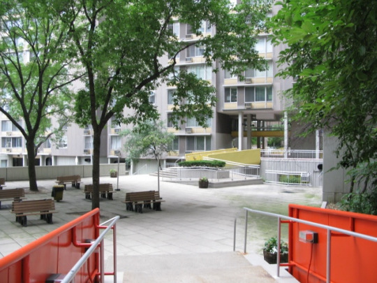
If not intellectually surprising, then, the striking modernist vistas at Roosevelt Island are nonetheless unexpected. The buildings themselves reflect the austere geometry of the International Style–boxes and rectangles–but tempered for human needs, including the need for visual diversity. The step-backs and ample fenestration provide panoramic views of the river and the City; a walkway with benches loops the island; both the Eastwood and Riverview have indoor pools.

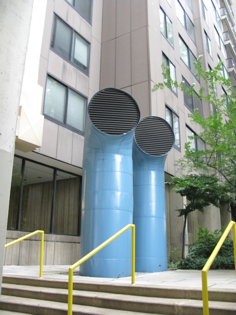
As for the appearance, it is textbook Brutalism: texture, pattern, and color temper the structural geometry. Beton brut–raw concrete–is the dominant material, followed by brick, slate, colored ceramic tile, and painted metal. Elements such as the painted tubular ducts, reminiscent of a ship, add nautical local flavor. The colors–orange, yellow, blue–recall Corbusier, as does the use of pilots.

A close look at exterior detailing reveals a tapestry of pattern, material, shape, and color, such as at the entrance to the Rivercross. Even a view up the façade shows a juxtaposition of line and shape, horizontals and verticals that change with the light and weather. The interiors of both buildings feature orange and yellow tiles, and spare but warm furnishings mixing wood and metal with leather and fabric. Highly textured concrete walls in the recently restored Rivercross become visual features. Unfortunately, I was not encouraged to photograph the interior at Rivercross, or I’d be sharing those images here. I’m not sure what type of reception you can expect, but it is worth a trip on the tram to look at these two buildings, and to experience the quirky and somewhat quixotic architectural moment of 1970’s Brutalism.

Modern Venetian Handicraft

Originally posted April 22, 2010 on interiordesign.net

Last week (2010), Venice hosted a Design Leadership Summit that brought together a few hundred design leaders from the United States to discuss things that design leaders discuss. I was not invited, nor did I get a T-shirt. I did, however, find a book (in Brooklyn) called “Artigianato Veneto,” or Venetian Handicraft. Published in 1971, the book showcased recent work in fields such as glass, metal, ceramics, jewelry, wood, lace, printing, and textiles, while also tracing the traditions and history of these crafts as practiced in Venice.

The timing of the book suggests a civic purpose in terms of celebration and promotion. Being planned at the time was the seminal exhibition of Italian design to be held at MoMA in 1972 under the title “Italy: The New Domestic Landscape.” More to the point, held the year before, in 1970, was an exhibition in Milan called “Milan 70/70” that was both a retrospective of a century of design in Milan and a celebration of a decade that elevated Milan to the center of the design universe. For all its glorious craft traditions and modernist achievements, Venice was probably feeling like a second city, and “Artigianato Veneto” was probably an attempt to redress this imbalance while promoting Venetian crafts to the world (the text was printed in English, French, and German, as well as Italian).

Tradition and history are a source of civic pride, and the region around Venice, which includes Verona, Padua, and Murano, has a rich history of artisanship, manufacture, and trade. These histories are referenced for each of the crafts discussed, but the thrust of the book is forward-looking, toward the mid-20th century and beyond. How else could Venice respond to Milan’s indisputable leadership in conceptual, utopian, and anti-design? How else to compete with Joe Colombo, Vico Magistretti, Gae Aulenti, Achille Castiglioni, Flos, Artemide, and Kartell, but with a handicraft rooted in a glorious past yet creating a sort of beauty organically linked to the present? It is worth noting that plastic—both symbol and medium of 60’s avant garde Italian design—is not even mentioned in “Artigianato Veneto.”

What is mentioned, and what occupies the largest section of the book is, of course, glass from Murano. The catalog here shows masterworks of modernist glass in both technical and artistic capacity. Richly illustrated with works by Venini, Barovier, Seguso, Toso, Vistosi, Salviati, Barbini, and Martinuzzi, the glass section alone commends Venice to the attention of modern design enthusiasts, though the greater works are of mid-century rather than late 60’s origin. Shown here are vessels by Aureliano Toso and colorful turkeys by Venini.

Beyond glass, the book shows children’s furniture in wood by Gigi Sabadin, pottery and ceramics “in modern shapes” by Gastone Primon and Marisa Sartoretto, and a ceramic sculpture by Federico Bonaldi, very much in a late 1960’s idiom. Still, it is the metal work that catches the attention as the region’s second most interesting modernist craft. Padua shares the spotlight here with Venice, as it was home to Paolo de Poli, the enamalist who collaborated with Gio Ponti on a famous series of enameled animals, pictured here. Also shown is a fretwork silver vase by Andreina Rosa, a mirror with a zinc and lead frame from Artigiano Peltro, and a gold necklace by Atelier des Orfevres. Thrown in for good measure is a vignette of scarves by Tiziana Carraro.

Forty years later, the 60’s design from Milan remains conceptually compelling and, not incidentally, marketable. The best work produced in the Venetian region during this period, if less radical, still looks important and fresh, and as for marketability, I see a trip to Venice in my future. Hear that Leadership Committee?