A Fairy Tale of New York: The World’s Fair

Originally posted March 19, 2009 on interiordesign.net

Once upon a time, never mind how long ago, a young boy visited a great World’s Fair. It was a signal moment in the boy’s life, and he was fortunate to return several more times before it closed.  Being a young boy, much was new to him, but in his estimation nothing could match the fair for sheer wonderment and delight.  The fair was a vast smorgasbord of sensory stimulation: visual, aural, gustatory, and tactile.  Everywhere he went there were things to see and do.  There were buttons to push and rides to ride; there were exotic smells and new things to eat.

The fair seemed to the boy to be in constant motion, what with the monorails and jitneys, flume rides and moving walkways, and the constant throng of bustling visitors.  He rode up and down and around, he soared to dizzying heights, and he traveled in time and space.  The boy enjoyed visiting the past, but the entire fair drew him inexorably toward a future that appeared bright and bursting with possibility. The boy sensed a heady synchronicity in this as his entire life was ahead of him, and he wondered if others felt the same way.

The boy reveled in the details of the fair, and they burned into his memory.  The Kodak Pavilion, with its picture carousel, the Ford Pavilion, with its car ride through time, the phone booths, the line to get onto the monorail, the costumes and customs of different countries, the tacos and Belgian waffles, the Pieta, the dolphins and flamingos, the dancers and mariachi, the map of New York state you walked across, Snow White and Sneezy, and the Disney ride that supplied the soundtrack that ran continually through the boy’s head—"It’s a world of laughter a world of tears, it’s a world of hope and a world of fears…"

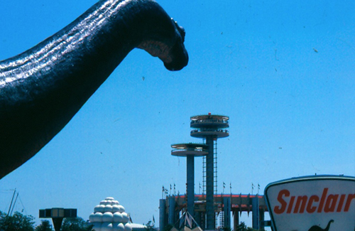
And, of course, there was Dinoland. Truth be told, if the boy had his way, he’d have spent all his time with the dinosaurs, as long as someone brought him a Belgian waffle every now and then. Towering over the Fair, visible from the highway, were full-sized replicas of all his favorites—tyrannosaurus, brontosaurus, allosaurus, stegosaurus, triceratops.  He could name them all, and recite their vital statistics and food preferences.  Dinosaurs were the boy’s passion, and he felt himself lucky indeed to be walking amongst them.

Looking back years later, never mind how many, the boy--now a man--still marvels at the sheer wonderment of it all.  It was so exotic and exciting, so stylish, beautiful, and magical.  There were so many new things to see, an ever-changing kaleidoscope of shapes and colors.  The boy knew little of art and even less of architecture, but he absorbed and felt and learned.  He took it all in, and it took him in, and the visual imprint remained dormant in him for years until such time as he was ready to see things that way again.  The man now has nephews who play marvelous video games undreamt of when he was young, but to be six years old at the fair--he would not trade that for the world.

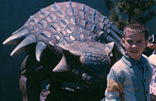
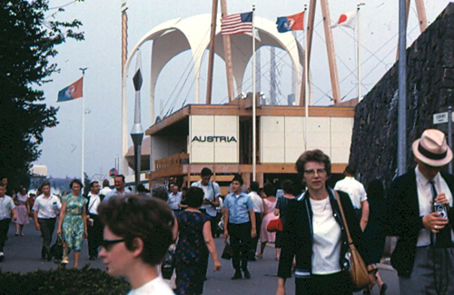
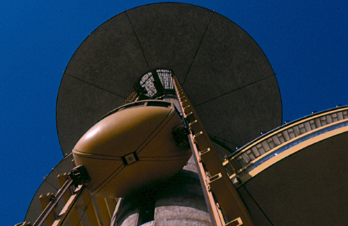
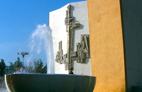
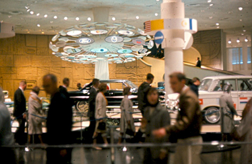
Images from top: Dino the Dinosaur overlooking fair grounds; Austrian pavilion as mise-en-scene; Upward look at elevator of New York State Pavilion; Glass dome of New York State Pavilion; Yellow and white close-up with fountain; Interior shot of the Ford Pavilion; View of Swiss Sky Ride; Larry Weinberg as a small child with dinosaur. All images by Richard Weinberg.

A Tale of Two Decades

Originally posted on February 8, 2009 on interiordesign.net

Design sometimes transcends its moment and continues to look fresh, and by virtue of this, timeless. Such is the case with some of the products designed by Braun or Olivetti. Other times—and this is not necessarily a bad thing—design gets caught up in its moment and winds up encapsulating or expressing a specific cultural or stylistic fact. These products may work well, and wind up in use for years, but they betray their production date at a glance, and retrospective interest in them is inevitably tinged by nostalgia.

One such design, pictured above, is a free-standing speaker attributed to Phillips. The housing is plastic, the grille perforated metal. If I had to pick a date of production—and I don’t know for sure—I would pick the mid-1950’s. I would not pick the 1940’s, nor would I pick the 1960’s, at least not after 1965. This speaker looks to me like nothing so much as a Morris Lapidus hotel on Collins Avenue. I can almost picture the palm trees lining the circular drive in front, and the biomorphic pool fronting the beach in the back. I don’t know if the tweeter is separated from the woofer, but the top pivots, throwing the swooping curve into sharp relief. I think it looks cooler this way, and I think the hotel it resembles would look cooler this way, too.

In any event, the logo on the front—possibly a PH in a box—is also of the era, and the entire design exudes 1950’s style and swagger. Despite being dated in this way, I would hesitate to call this design kitschy. The best definition of kitsch I’ve encountered, outside of the one in the dictionary, is an object that conveys everything it has to convey at a glance. I’ve had this speaker (actually, a pair of them) for several years, and I am still intrigued by them, and without irony. This has something to do with the way the appearance changes when the top is straight or askew, how different it looks from the front and the back, and how the brass grille catches the light, sometimes shimmering, sometimes stopping the eye at the surface, and sometimes permitting the eye to see through—almost like architecture.  Also, I suspect the speaker would sound good if I could plug it in to anything, especially with the top part swiveled to direct the tweeter at the listener’s position.

The JVC video capsule, also made primarily of plastic, is equally dated, albeit to a different decade. As its name suggests, it looks, with the video element closed, like an Apollo space capsule, and if you guessed a production date around 1970, in the wake of the moon landing, you would be correct. The fact that my 12-year-old nephew could have guessed this really locates this object in a precise cultural moment (Actually, my nephew is really smart, and would upbraid me if he read this, saying something like “I must upbraid you, Uncle Larry.”). With the top up, the TV looks something like a robot. Being a Japanese product, I suspect that there is a specific reference to a movie or TV robot of the late 1960‘s.  In the end, I’m not sure this design falls on the good side of the kitsch line, but I’ve kept it because I would have loved to have one in 1970.

Passion Flowers

Originally posted on July 23, 2009 on interiordesign.net

Flowers have long occupied an exalted place in both the fine and decorative arts. As subject matter of still life for artists as diverse as Monet and Mapplethorpe, inspiration for patterns on textiles and dinnerware, and for applied ornament on furniture, flowers have served as a primary motif and symbol.

So there’s no reason to make excuses for an obsession with flowers, right? The reason I’m asking is that my father spent a lot of time with flowers. He grew basic ones such as roses, chrysanthemums, rhododendrons, and tulips. But mostly he shot them, with a succession of cameras from Leicas and Hasselblads to digital Canons. He shot them on trips to the tropics, the Canadian Rockies, California, New England, Old England, France, and Italy. Most of the time, however, he shot them in his own backyard, the neighbor’s backyard, and nearby parks. He made weekend trips to local garden stores, ostensibly for peat moss, but he always brought his camera.  

If you asked him why, which I never did, because from childhood I was glad when he was shooting flowers and not me, he probably would have said he was testing lenses or new cameras, or was solving technical problems of composition, lighting, focus, exposure, and depth of field. But this would have been protesting too much. The fact was that he shot the sh&# out of flowers, from as early as I can remember up until he passed away last spring.

Was he doing more than honing his technical skills and testing equipment? I think so. My father loved flowers, their colors, shapes, and textures, their translucence and delicate beauty, and he lost himself in the challenge of coaxing something out of them. It was one of the few times in his life that he stopped to smell the roses. The small, intimate, and self-contained worlds he created in his floral photographs were alternately vibrant and lush or moody and ethereal; they were often magical and, as much as I hate to say it, sensual. They were certainly mechanical and technical exercises, but, however tentatively, they were also spiritual and artistic explorations.

Thoreau once said, “Many men go fishing all their lives without knowing it is not fish they are after.” I think my father eventually came to grips with his inner poet, and with some of the lessons to be gleaned looking at flowers, and I think the tipping point was a trip to Monet’s gardens in Giverny in the spring of 2000. My father wrote ahead, submitted a portfolio, and obtained permission to shoot the grounds. Looking around at the artists sketching, and working alongside them, I think he finally saw himself as a kindred spirit.

At Giverny, my father primarily shot landscapes, another passion (and another story), but he returned to his backyard inspired and liberated, and proceeded to spend the summer vigorously and joyously shooting flowers. The images he took show greater self-assurance and confidence, they are bolder and literally more focused. The entire process seems more organic and intuitive: eye-hand-camera, experience and spontaneity, seeing and creating un-self consciously, and taking pleasure in the doing—knowing his equipment, knowing his technique, knowing flowers, and learning about himself. Thoreau would be proud.

Modern Spanish Furniture

Originally posted September 17, 2009 on interiordesign.net

When you think of Spain, mid-century design is not the first thing that comes to mind…or the second…or third. In fact, you would be hard-pressed to name a single Spanish designer or architect working after Gaudi, except for Jose Luis Sert, who left Spain for America in 1938. I’m not sure why this is, but two possibilities suggest themselves.

First, Spanish modernism simply languished after WWII. Second, post-war Spanish modernism is out there to be rediscovered. Given the virtual absence of Spanish sources in the major design yearbooks of the mid-century—Arredimento Moderno, Studio Yearbook, New Furniture—and the presence of Latin American architects and designers such as Niemeyer, Tenreiro, and Rodrigues—it is tempting to conclude that less modernist work was produced in the mid-century in Spain than elsewhere, and what there was flew under the radar to begin with an exhibition held at The Met a few years ago, “Barcelona and Modernity: from Gaudi to Dali,” tracked Spanish art, architecture, and design in the first three decades of the twentieth century, from the glory of Gaudi to the reaction against the perceived excesses of Art Nouveau. 

By the 1920’s this reaction took two forms:  a revival of interest in tradition in architecture and handicraft, and the emergence of a school of minimalist rationalism that became the Spanish arm of CIAM and that culminated in the Barcelona Exhibition of 1929, with the famous Mies Pavilion and the Barcelona chair. After 1930, it seems that much of the story simply remains to be told. The strong impulses in Spain toward tradition and minimalism, coupled with Catholicism and fascism, may not have been conducive to the exuberant brand of mid-century modernism of Eames, Molina, and Finn Juhl, but they were not necessarily inimical either. Too, the Spanish mission style, transplanted to California, was one of the progenitors of 20th-century design. Sooner or later, we would expect to find Spanish modern design, whether pan-European or regional and idiomatic. The question is, where?

One answer is in the pages of “Arquitectura Interior,” a yearbook of design published in Madrid and edited by the architect Carlos Flores. I have four volumes in my library, 1959 and 1962-4. The 1959 volume provides something of a survey of the European and American modernism of the moment, and while it includes some indigenous Spanish design, the gist is that of spade work—a primer on the New Look for a constituency just being exposed to it.
By 1962, however, the task of defining and promoting Spanish modern design has begun in earnest. The introduction, roughly translated, predicts that contemporary Spanish living environments can soon be furnished with Spanish design exclusively.

While this confirms the supposition that there was little in the way of Spanish modern design through much of the 1950’s, the 1962 issue introduces us to a host of Spanish designers now plying the modern idiom, and doing so with confidence, inventiveness, and verve. I’ve singled out a cantilevered steel chair by Fernando Ramon, referencing Mies, as a point of departure; a table by Antonio de Moragas that channels mission in its solid simplicity, with a nod to the mid century in its flexibility—the top slides to any position—and demountability; an auditorium chair by Miguel Fisac with a nice posture and sculptural presence; a rakish three-legged plywood chair by Jose Dodero recalling Wegner, Prestini, and Tenreiro; a nice constructivist chair by Julio Bravo, et al; and a fluid lounge chair by Equipo 50 revealing its skeleton of wooden slats.

As for interior design, I was drawn to the clean, Spartan spaces that recalled Spanish monasticism, particularly the dorm room by Obra Sindical del Hogar y Arquitectura, and the foyer by Federico Correa and Alfonso Mil, with its bull’s horns. I also liked the varied textures and patterns in the interior by Oriol Bohigas and Jose Maria Martorelli. The names of these designers and architects may all be unfamiliar, but the work speaks across the decades, and there is no reason I can see why they should not be part of the current dialogue.

From top: steel and leather chair by Fernando Ramon; flexible coffee table by Antonio de Moragas; Constructivist chair by Brava, Lozano, and Pintado; chair by Miguel Fisac Spain; plywood chair by Jose Dodero; ribbed chair by Equipo 57; Cabinet by Salvador and Tomas Diaz Magro; interior by Obra Sindical del Hogar y Arquitectura; interior by Federico Correa and Alfonso Mila; interior by Oriol Bohigas and Jose Maria Martorelli.

The Lives They Lived: Fran Hosken

Originally posted December 30, 2008 on interiordesign.net

To be a designer in mid-century America was to be part of a club of like-minded individuals, widely literate, socially concerned, and avowedly activist. Trained at places like Cranbrook, the New Bauhaus, and the Harvard Graduate School of Design, a young generation of designers shared with their teachers a sense of responsibility and efficacy. Boundaries were fluid, so that furniture or industrial designers also engaged matters of architecture, landscape design, community planning, and urban renewal. As fully-rounded citizens, designers were above all cultural participants, with a level of commitment and dedication we today can only acknowledge and admire.

Franziskas Porges Hosken (1918-2006) was born into a prominent Jewish family in Vienna and immigrated to the United States in 1938. She graduated from Smith College in 1940 and moved to Boston to study architecture and design. One of the first female students admitted to the Harvard School of Design, she earned her Masters in Architecture in 1944. At Harvard, Fran learned Bauhaus ideas and methods from Gropius and Breuer, and Kepes and Moholy-Nagy. While a graduate student, she designed and built a flip-down dining set for her own use, a design that would later be featured in a prestigious international design review. Fran began designing furniture for the market in 1947, and along with her husband, James Hosken, founded Hosken, Inc. later that year. One of her first projects, a stacking stool, became a commercial and critical success. More acclaim would follow. Over the next few years, their work was published in Furniture Forum, The Everyday Art Quarterly, Arredimento Moderno, House and Garden, and The New York Times. It was distributed by Knoll, Raymor, and Macy’s, and was shown at the Chicago Merchandise Mart (including a MOMA Good Design selection in 1951) and the Milan Triennale. Despite this promising start, the business foundered in 1951 when Fran had her first child and a deal for a factory space fell through.

Writing about her own career for a retrospective at the Lin-Weinberg Gallery in 2001, Fran noted that “Hosken, Inc. was a good idea; the time was right, but we had no capital and no investors to back us up and too little business experience.” She went on to observe: “Now some 50 years later the very concept of what was called ‘modern’ by a new generation of architects has vanished especially in housing and furniture. The great wave of enthusiasm for ‘new design,’ starting with a new social concept of housing and ‘form follows function’…is gone and has vanished, which I deeply regret. The design and social ideas which I still believe in and which I then thought would sustain the production of simple, demountable, and affordable new furniture…for young families are dead and gone.”

Fortunately for posterity, Fran was anything but a pessimist, and with the closing of one door, many other doors opened. During a long and varied career, Fran defied conventions and forged a path of her own choosing. She was a pioneering architectural photographer and archivist (the bulk of her collection is now at Texas A&M University). She was a journalist and teacher on matters of design and architecture. She published books about urban planning, notably The Language of Cities (1968). She traveled extensively, particularly to Africa and Afghanistan, and gained first-hand knowledge about women’s issues in Third World countries. Not one to be limited in her own options, she became active in feminist causes beginning in the 1970’s, serving on the boards of numerous organizations, and founding WIN, the Women’s International Network, a pre-internet means of connecting women and issues globally. She published and distributed a feminist newsletter out of her own house until well into her eighties. And she took up painting in her fifties, becoming a fairly accomplished artist.

I came to know and admire Fran while planning an exhibition of designs and design prototypes from her own collection. Fran was flattered by the belated attention to this part of her career, but it quickly became apparent that the furniture and jewelry that so interested me was but a footnote to Fran. Fran wrote me in April 2001 that she would try to attend the opening of her exhibition–we were providing transportation and accommodations–if she finished publishing the current edition of WIN NEWS in time. This was humbling to me, but demonstrated Fran’s focus and fierce dedication to issues that mattered to her. As her daughter-in-law eulogized, “She felt that unless you were doing something for the world, you were useless.” With Fran’s passing in 2006, the world of design–and the world at large–lost a passionate and tireless advocate.