italian

The Modernism of Lina Bo Bardi

Originally posted June 10, 2010 on interiordesign.net

“The most important thing [in architecture] is not to construct well but to know how the majority of the folk live.” -Lina Bo Bardi, 1975

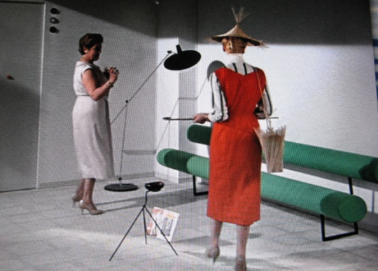
Lina Bo Bardi (1914-92), the Italian/Brazilian polymath, remains an under-appreciated modernist architect, designer, and thinker. The reasons for this surely include gender-as a woman, she was overshadowed by Niemeyer and Costa, and by Rodriguez and Tenreiro. Also, a lavishly illustrated treatise published in 1993 by the Instituto Lina Bo e P.M. Bardi is written in Portuguese (thanks to my half-Brazilian summer intern, Anna Levenshus, for her translations), and a perceptive article from 2002 is in the Harvard Design Magazine, neither of which sit on many American coffee tables. Of her architectural projects, The Glass House (1951) and the Sao Paolo Art Museum (1957-68) are perhaps known, as is the Bowl Chair (1951) among her designs. The rest is ripe for rediscovery and reevaluation.

It is tempting to see Bo Bardi as a sort of hybrid flower, transplanted from Italy to Brazil, where she blossomed in the unfettered and lush environment, trading an early Corbusier for a mature Frank Lloyd Wright as an avatar, shucking the encroaching formalism of the International Style for a direct and unencumbered engagement of local needs (both material and psychological), customs, topography, and materials. In short, as a proponent of the sort of dynamic and organic modern architecture advocated by Bruno Zevi, with whom she edited a journal in the mid 1940’s. Zevi, an Italian Lewis Mumford, opposed classicism, reductionism, or a priori thinking and embraced, a la FLW, an architecture style oriented toward space and the life taking place within that space. To Bo Bardi, the rain forest/wilderness held a promise of creative liberation: “Brazil is an unimaginable country, where everything is possible.” Bo Bardi’s thoughts about the Brazilian zeitgeist, quoted above, points in this direction.

The problem with this notion is that Bo Bardi was pretty much full-grown before she left for Brazil. She possessed a degree in architecture, was well-versed in Italian rationalism, influenced by early Corbusier, and by the design agenda of Gio Ponti, for whom she worked and edited. Tossing Zevi into the mix makes for a complex mix. On some level, Bo Bardi absorbed and internalized any number of conflicts within avant-garde modernism. Her career in Brazil probably represents a working through of these conflicts rather than any resolution of them-abandoning a priori thinking is easier said than done.

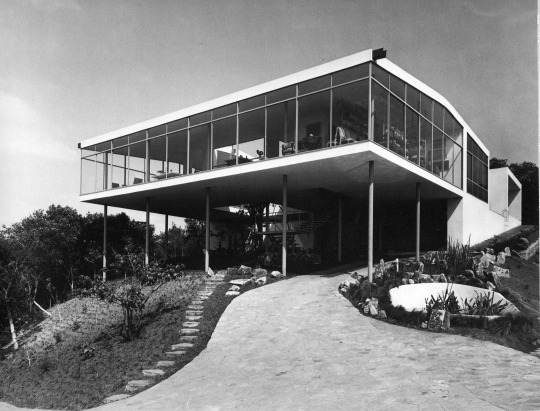
Five of the six images shown here illustrate this. The Glass House, built as her own residence in 1951, is obviously less William Wurster than Mies or Philip Johnson. The early photo of the house, sans flora, shows a sort of Farnsworth House on pilotes–a glass box plunked down on the edge of a rain forest. That Bo Bardi replanted and intended the rain forest to grow back around the house makes little difference-the photo has its own visual and historical reality. The second image, with the house hidden amidst the flora, casting ever-changing reflections, is closer to the Johnson Glass House of 1949, and more in the direction of the dynamic/explosive/regional, providing that the rainforest was allowed to grow back naturally and chaotically (as opposed to the planted, pruned, mowed, and over-determined landscape at the Johnson House). The overall impression is of an International Style goldfish bowl, a holding tank for acclimating to a new environment.

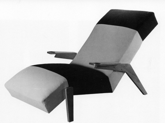
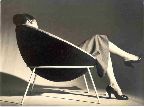
Similarly, the two furniture designs shown here, while very much of their moment synchronically, are less specific in terms of place. Either one could have been designed and produced in Italy-the chaise of 1948 is reminiscent of Ponti in its shape, the planes of the arms, and two-tone graphic character of the upholstery, while the Bowl chair of 1951-a rationalist hemisphere atop a circle and four lines-could have been done by Roberto Mango. Unless the bowl represents a coconut shell, there is little connection to Brazil. More connection is seen in the Casa Cyrell of 1958, with its thatched roof, local ceramic shard-laced cement walls outside, Santos inside, and profuse vegetation everywhere.

All this only suggests that Bo Bardi, like Corbusier, like Frank Lloyd Wright, was a complicated figure. Any reassessment of her career needs to apprehend this. Her story, as it continues to emerge, will shed light on a number of Big Themes in the history of design and architecture-gender, politics, philosophy, aesthetics, housing and so on.

‘Mon Oncle’

Originally posted October 23, 2008 on interiordesign.net

image

I watched Jacques Tati’s “Mon Oncle” (1958) the other night. Focusing on the furniture, I came to realize a few things about the film: Yes, it is a satiric send-up of modern technology and culture, a parable that opposes a modern world at once sleek, antiseptically clean, automated, superficial, and inhospitable with a traditional milieu that is spontaneous and convivial, if messy. And yes, Tati is a  latter day Chaplin (or present-day Lucille Ball?), a French everyman whose bumblings expose the sterility, fatuousness, and pretension of modern machine civilization. But people who live in glass houses shouldn’t throw stones, and at least part of Tati occupies the modernist and strikingly beautiful Villa Arpel.

image

Tati was born in 1907 and came of age during the 1920’s, the heyday of avant-garde modernism, the era in France of Mallet-Stevens and a young Le Corbusier. If you plainly see in “Mon Oncle” Tati’s nostalgia for a traditional, older world (which, incidentally, was not about to disappear soon in 1950’s France), you also see the formative artistic pull of modernism. The Villa Arpel reflects a sensibility weened on Le Corbusier—it is an iteration of the “machine for living in,” with its technical gadgets, its decorative asperity, and its conspicuous lack of comfort.

image

But even in the 1920’s, the machine for living in was more a polemical construct than an actuality. By 1956, no one near the mainstream was seriously advocating living in a machine, nor was minimalism apropos to a decade of rampant consumerism. The Villa Arpel was hence an easy target for satire—a clay pigeon, really—and an idiosyncratic vehicle for a parable.

image

It was also an expression of Tati’s own artistic temperament. Tati was a mime with a mime’s economy of motion, gesture, and obviously, words. Minimalism is integral to this art form, and naturally extends to set design. It is not surprising, then, that the Villa Arpel is minimalist (“this is the vase”). What is surprising is how far beyond caricature Tati ventures. The Villa Arpel sets are brilliantly edited and meticulously executed, from the selection of furnishings, which include works by designers such as Baltensweiler, Chambost, Mategot, and Motte, to the spare and elegant arrangements of the pieces, to the vivid accents of color visible in the furniture and clothing, to the outdoor landscaping. The vistas are visually exciting and photographically beautiful. Tati needed only to construct a target for his arrows; instead, he created a tour-de-force of mid-century modernism that looks as fresh today as it did fifty years ago, and still resonates as an abstract work of art.  In its day, the Villa Arpel was copied by a fan as a residence; more recently, it has been the subject of museum exhibitions tracking Tati’s influence on modern design. In the end, the Villa Arpel was rendered with such aplomb and virtuosity, it was so clearly inspired, that it documents the undeniable joy, delight, and creative exuberance unleashed by avant-garde modernism, and this complicates the message of the film, or perhaps makes it a greater work of art.

image

Nowhere is Tati’s ambivalence toward modernism more apparent than with the furniture he designed (along with Jacques Lagrange, his longtime set designer) for the Villa Arpel.  The three key pieces—the “Haricot” sofa (shaped like a bean), the rocking chair with the yellow seat, and the “Harper” sofa (think two tootsie rolls connected by a folded paper clip)—are designed to convey discomfort. At this they succeed, but again Tati goes further than needed.  The rocking chair has a long seat and short back, forcing M.  Arpel to slouch when seated, but this element creates an asymmetry that is visually exciting.  The Haricot sofa looks impossible to lounge upon, and Hulot is forced to turn it on its side to sleep on it.  Try this, though, and you will understand how much effort went into the design, which referenced both Perriand and Kiesler (the 1942 Peggy Guggenheim installation).The Harper sofa is shown with a woman perched rigidly on it, but it is the most beautiful of Tati’s designs—and one of the most striking sofas of the fifties—bridging the precision of the machine age and the sculptural presence of the mid-century (Lescaze meets Noguchi).  One could even argue that these pieces rate highly as good design; they are visually excellent and suited to purpose, given that their purpose is to look uncomfortable.  As a testament to their enduring appeal, all three designs were recently issued by Domeau & Peres in an edition of eight. Ironically, Tati anticipated not only the minimalism of the 1960’s but the limited-edition, not-for-comfort design/art of the present decade.

image