‘The Jetsons’ on the Drawing Board

Originally posted September 30, 2010 on interiordesign.net

From time to time I look online for still images of “The Jetsons” interiors for a post about cool futuristic design in animated TV sitcoms. Sooner or later, I’ll rent the DVD of the first season and photograph selected frames. Yesterday, though, I came across a website devoted to the animation art of Irv Spector, put up in 2008 by his son, Jay.

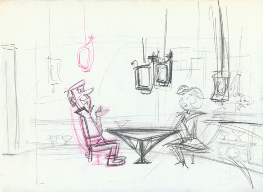
Irv worked for Paramount and Hana-Barbera, and one of his assignments was to do background and character studies for the first season of “The Jetsons.” For anyone growing up in the 1960’s, the show was a must-see, a futuristic version of “The Flintstones,” which was itself an animated variation of “The Honeymooners.”

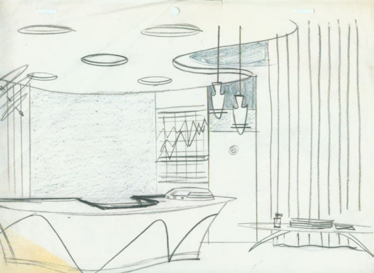
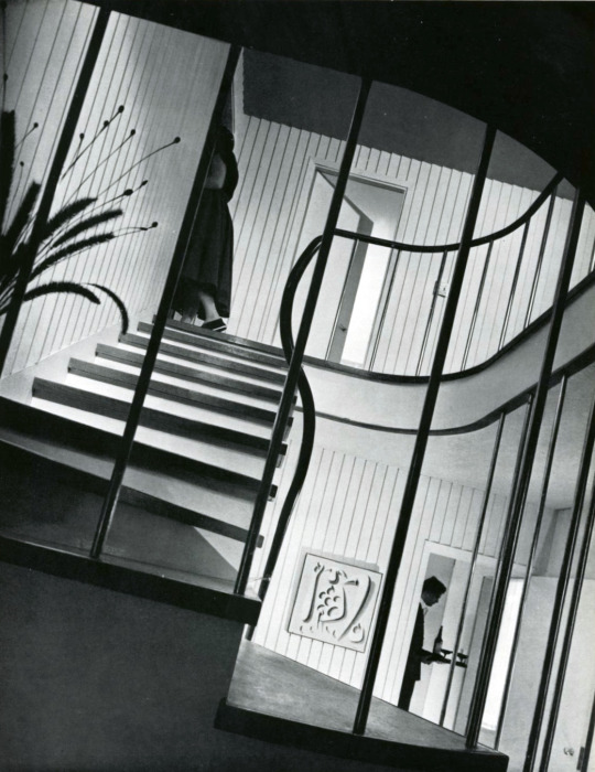
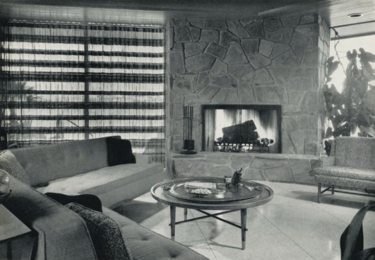
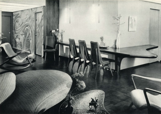
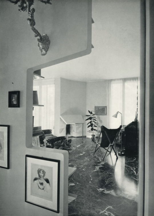
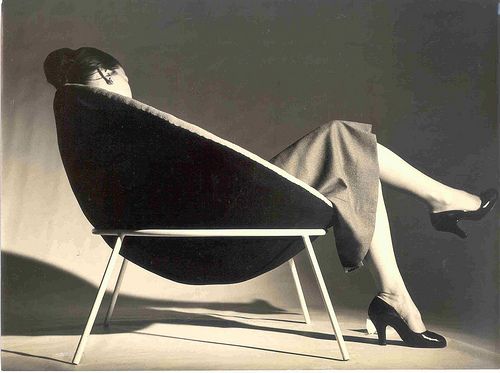
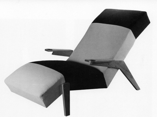
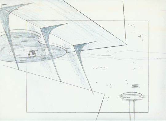
Premiering in September 1962 on Sunday nights on ABC, “The Jetsons” had an initial run of 24 episodes, ending in March 1963 (it would be resurrected for another 50 episodes in the 80’s). Thanks to serialization, “The Jetsons” had a cultural impact beyond its short run-“that’s so Jetsons” is still a pejorative way to describe postwar design. Yet, as the renderings shown here demonstrate, the creative vision behind the program had much on the ball in terms of architectural and design savvy.

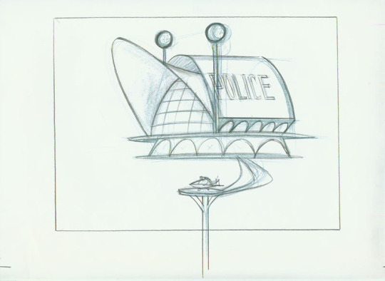
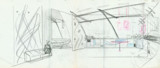
Among Irv Spector’s papers was a drawing of Saarinen’s TWA terminal-to Jay Spector a clear indication of the primary source of inspiration. The other source mentioned on discussion boards is the Seattle Space Needle. Both structures are clearly visible in the parabolas, swooping arcs, soaring arches, and freeform shapes of Irv’s drawings-the police station is a miniature TWA terminal; the tower on the right, a version of the Space Needle. I especially like the first three renderings, sans George and Jane-these look like architectural or interior design proposals from a leading early 60’s firm, more Oscar Niemeyer, even, than Morris Lapidus (sorry, Morris).

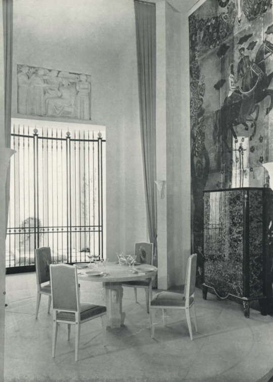
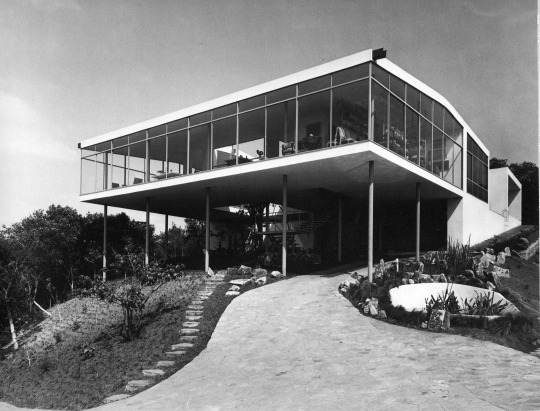
Surely, the vision of the future presented in the Jetsons owes much to 50’s architectural and design practice-this, after all, was the “googie” decade, the era of Las Vegas and Miami. But it is worth noting that both the TWA Terminal and the Seattle Space Needle opened in 1962, just as “The Jetsons” came on the air. This sort of aesthetic synchronicity is rare in movies or TV; just look at “Men in Black,” where the futuristic furniture was designed in the 50’s and 60’s. Even Morgue’s Djinn series came out three years before “2001” aired. So people watching “The Jetsons” in 1962-and given the Sunday-night time slot, this likely included as many adults as children-were absorbing utterly contemporary interior design and architectural references that conveyed futurism in their moment (“The Jetsons” was set in 2062) and still continue to do so.

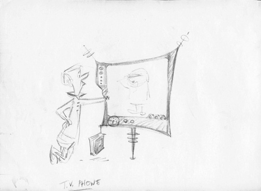
As for the gadgets and gizmos, that is another story, but have a look at the flat-screen TV/video phone shown here. Thanks, Jay, for sharing your father’s work.

Carney on Design

Originally posted September 2, 2010 on interiordesign.net

Clive Carney was an Australian interior designer who took a hiatus in the late 1950’s to assemble materials for a book describing and depicting best-practice modernist interior decoration in a global context. His “self-imposed assignment” took him to places such as Paris, Helsinki, Stockholm, Mexico City, and New York. A considerable amount of time was apparently spent in Los Angeles, Palm Springs, Honolulu, and Miami. Evidently, no hardship was spared in the search for décor. Between daquiris and dips, he managed to shoot or cull photos of interiors by a who’s who of designers and architects, in a range of styles from austere to opulent, and accessible to elite.

Among the luminaries sampled are Robsjohn-Gibbings, Gropius, Breuer, Wormley, Kagan, Dorothy Draper, J. Leleu, Kenzo Tange, Laszlo, Arbus, Knoll, Topiavaara, Gardella, and Fornasetti. Projects range from private residences to offices, restaurants, and hotels. Carney’s book, “International Interiors and Design,” published in 1959, is organized into ten chapters, with lead essays by the likes of Paul Reilly (“The State of British Design Today”), Edward Wormley (“Modern Design”), Jules Leleu (“Decorative Art in France”), and Carl Malmsten (“To Build and Dwell”). There are several dozen eye-popping interiors, so selecting six to illustrate here is a subjective task. What I’ve come up with follows:

1. Stairway in the home of Walter Gropius, Lincoln, Massachusetts. Gropius and Breuer, architects. Nice photo by Robert Damora. Note the guy with the martinis. I’m guessing Carney was schmoozing his way around the world. Very Mad Men. I don’t know who did the wall sculpture–Arp, Sidney Geist?

2. Living room of a Los Angeles residence. Cannell and Chaffin, designers. A relatively humble project, but it has clean lines and a hospitable, serene feel. I like the window treatment and the arrangement of the furniture in relation to the fireplace.

3. Living room in Milan. Interior design by Piero Fornasetti. Fabulous and fabulist. Could anyone integrate pattern, or relate objects to graphics, better than Fornasetti?

4. Living room in a New York apartment. Interior by Vladimir Kagan. Kagan’s work as an interior designer is less-known than his furniture design, but like Wormley, Robsjohn-Gibbings, and Laszlo, Kagan did commission work–and interiors–for clients. The faux wall and the dramatic built-in counter give the space an almost surreal feel.

5. Living room in the architect’s house in Milan. Ignazio Gardella, architect. The photo, taken by Carney, shows a vista bounded by a cut-out wall. The black marble floor and white walls, which could read cold, are warmed up by the wood furniture (which includes bookshelves just visible on the inside of the cutout), the gilt candelabra, and the artfully arranged artworks. The sheer drapes provide a soft illumination. Very sophisticated.

6. Interior by Andre Arbus. Speaking of sophisticated–I don’t know where this room rates in Arbus’ oeuvre, but it looks like a paradigm statement for understated elegance to me. Note the sculptured stone table base vis-à-vis the frieze, the full use of the height of the room, and the reflective surfaces of the mural and cupboard. Note, also, the martini glasses on the table–another soiree for our peripatetic author?

Trois Decennies of French Design

Originally posted on August 26, 2010 on interiordesign.net

A funny thing happened on my way to Magen XX Century, my friend’s chic, and primarily French, design gallery on 11th Street. I stopped at the Strand—just looking, Joan—and found, to my surprise, a 300 page exhibition catalog published by the Pompidou Center in 1988. As a rule of thumb, anything published by the Pompidou Center is worth having, and often hard-to-find. This one, which I had not seen before, was no exception. Even better, it was in the paper bin, priced at $3.50. The catalog, called “Design Francais, 1960-1990, Trois Decennies,” tracks French graphic, furniture, interior, and product design both alphabetically and chronologically through this creative and tumultuous period. In addition to a lot of captioned pictures of familiar and unfamiliar French designs, there are a series of essays in the beginning, with English translations. Can’t ask for much more for three and a half bucks.

A glimpse through the essays reveals a defensiveness or diffidence on the part of the authors, at least vis a vis Italian design. The lack of French counterparts to Archizoom and Superstudio in the 60’s, and Alchimia and Memphis in the 70’s, is lamented: “Why does God’s furniture always come from Milan and never from Paris? (Olivier Boiessiere).”

Most authors point to a lagging industrial aesthetic consciousness in France, from the public but also pointedly from industrialists. Still, what is lacking in structure is compensated for in eloquence. Paris may not have been a design hothouse like Milan, but it was the city of Derrida, Saussure, Barthes, Foucault, and their protégés, home to deconstructive and structuralist philosophy and criticism. And where Milan had Memphis, Paris had individual creative genius.

Thus, in a way, the catalog itself serves as an apologia-it states a case for French creative brilliance and relevance, in the critical texts and in the images presented. Catherine Millet makes the point that French artists, epitomized by Francois Arnal, who founded Atelier A in 1969, turned their hands to design after the events of 1968 in an effort to reach a broader public. That this failed was not surprising-“an object impregnated with a creator’s strong personality can only appeal to a few devotees”-but Millet points out that increasing media attention provided the circulation that the design itself did not. Advertisements and museum catalogs became the vehicles for disseminating avant-garde design ideas. An example in conjunction with the essay is the promotional image for the aluminum and rubber chair by Arman, produced by Atelier A, and shown here.

Of course, the French being the French, there was recognition that they might be protesting too much. So, in discussing the role of plastics in the 1960’s, Francois Kneebone noted that France was not far behind Archizoom in exploring this material, citing Marc Bethier, Marc Held, Olivier Mourgue, Pierre Paulin, and Christian Germanaz. Again, eloquence and individual éclat rather than structure. Shown here are two pieces from the acrylic “Kaleidoscope” series by Jacques Famery, produced by Steiner in 1967.

Of the many compelling images in the catalog, I selected four others to show here: Andree Putman’s project for the French Minister of the Interior (1985); a Pierre Paulin electric shaver for Calor, from the same year; the witty “looseleaf desk” of 1983, designed by Pierre Sala, who studied semiotics and stagecraft; and an image of paint cans designed in the late 1960’s by Jean-Phillipe Lenclose.

Mexican Modernism: The Next Big Thing

Originally posted August 12, 2010 on interiordesign.net

There is considerable reason to think Mexican modernist design will gain traction in the American market. Simple proximity to the United States, an indigenous tradition of craftsmanship, exotic materials, an expatriate community of designers, Marxist politics, and wealthy local patrons all point to a period of creative combustion ready to be rediscovered by market makers ever-hungry for new material. A 2006 monograph on Clara Porset, a 2007 museum show in Mexico City accompanied by a 566 page catalog entitled “Vida y Diseno en Mexico en Siglo XX,” and a recent monograph about Pedro Friedeberg, have raised awareness and piqued curiosity, while providing the basic scholarship that helps fuel sales.

Looking through “Vida y Diseno” it is easy to understand the appeal of Mexican modernism. Much of this well-edited and lavishly produced book is eye candy. The pieces in it appear familiar but with a twist; the sensation is like seeing undiscovered works by Gio Ponti or Charlotte Perriand. Mid-century standouts include a wood and tubular steel chair by Bauhaus-trained Mathias Goeritz, a decorative tiled table by Juan Cruz Reyes, a solid and naturalistic coffee table by Don Shoemaker, an “Equipal” chair by Pedro Ramirez Vasquez, and any number of works by Arturo Pani, Michael Van Buren, Clara Porset, or Pedro Friedeberg. Notable recent works include the sustainable furniture of Emiliano Goyod and Hector Galvan. The book reads like a who’s who, and figures to become the standard reference (and buyer’s) guide to Mexican modernist furniture.

Not included in “Vida y Diseno” is the work of Charles Allen and Edmund Spence. This is because both are American, and neither lived in Mexico. Spence made a career out of translating international modern styles for the U.S. market–he designed a successful blonde wood line made in Sweden and imported by Walpole Furniture of Massachusetts. Spence’s Mexican venture, dubbed the “Continental-American Collection,” was launched by Industria Meublera in 1953. A contemporary ad boasts “superb raw materials [and] fine Mexican handcraftsmanship,” and shows an Aztec stone deity apparently putting his imprimatur on three chair designs.

Somewhat less commercial, and more elegant and sophisticated, is Charles Allen’s line for Regil de Yucatan, imported by Yucatan Crafts–think Robsjohn-Gibbings does Tulum. An interior designer and muralist turned furniture designer, Allen was an aficion of the native woods and natural finishes found in Yucatan. His rakish, saber legged chairs and daybeds were hand crafted of solid mahogany, and woven with local sisal, while his case pieces incorporated machiche, grenadilla, and bajon woods in addition to the brass rods holding together the distinctive saw-horse bases. All finishes were hand-rubbed. In describing the collection in a 1952 article, design writer Gladys Miller enthused that it “fits perfectly when placed in the contemporary, casual but orderly and disciplined home.” Maybe Allen really did do his homework–the Mayans were nothing if not orderly.

Arguably, both Allen and Spence are susceptible to charges of cultural imperialism for appropriating stylistic elements and utilizing cheap labor and cheap, even endangered materials. Still, in terms of recognizing the design potential in Mexico’s cultural mix, and introducing Mexican-made modern furniture into the American market, Allen and Spence were well in the vanguard of a growing movement. As the market for Mexican modernism develops, look for blue-chip status to be conferred on certain designers, as with Brazilian design in the past decade. Look for the top galleries and auction houses to continue to offer up these names, and to dig deeper into the Mexican modern heritage. And look for Charles Allen’s mid-century designs at your local thrift shop, before these too are scooped up.

The Modernism of Lina Bo Bardi

Originally posted June 10, 2010 on interiordesign.net

“The most important thing [in architecture] is not to construct well but to know how the majority of the folk live.” -Lina Bo Bardi, 1975

Lina Bo Bardi (1914-92), the Italian/Brazilian polymath, remains an under-appreciated modernist architect, designer, and thinker. The reasons for this surely include gender-as a woman, she was overshadowed by Niemeyer and Costa, and by Rodriguez and Tenreiro. Also, a lavishly illustrated treatise published in 1993 by the Instituto Lina Bo e P.M. Bardi is written in Portuguese (thanks to my half-Brazilian summer intern, Anna Levenshus, for her translations), and a perceptive article from 2002 is in the Harvard Design Magazine, neither of which sit on many American coffee tables. Of her architectural projects, The Glass House (1951) and the Sao Paolo Art Museum (1957-68) are perhaps known, as is the Bowl Chair (1951) among her designs. The rest is ripe for rediscovery and reevaluation.

It is tempting to see Bo Bardi as a sort of hybrid flower, transplanted from Italy to Brazil, where she blossomed in the unfettered and lush environment, trading an early Corbusier for a mature Frank Lloyd Wright as an avatar, shucking the encroaching formalism of the International Style for a direct and unencumbered engagement of local needs (both material and psychological), customs, topography, and materials. In short, as a proponent of the sort of dynamic and organic modern architecture advocated by Bruno Zevi, with whom she edited a journal in the mid 1940’s. Zevi, an Italian Lewis Mumford, opposed classicism, reductionism, or a priori thinking and embraced, a la FLW, an architecture style oriented toward space and the life taking place within that space. To Bo Bardi, the rain forest/wilderness held a promise of creative liberation: “Brazil is an unimaginable country, where everything is possible.” Bo Bardi’s thoughts about the Brazilian zeitgeist, quoted above, points in this direction.

The problem with this notion is that Bo Bardi was pretty much full-grown before she left for Brazil. She possessed a degree in architecture, was well-versed in Italian rationalism, influenced by early Corbusier, and by the design agenda of Gio Ponti, for whom she worked and edited. Tossing Zevi into the mix makes for a complex mix. On some level, Bo Bardi absorbed and internalized any number of conflicts within avant-garde modernism. Her career in Brazil probably represents a working through of these conflicts rather than any resolution of them-abandoning a priori thinking is easier said than done.

Five of the six images shown here illustrate this. The Glass House, built as her own residence in 1951, is obviously less William Wurster than Mies or Philip Johnson. The early photo of the house, sans flora, shows a sort of Farnsworth House on pilotes–a glass box plunked down on the edge of a rain forest. That Bo Bardi replanted and intended the rain forest to grow back around the house makes little difference-the photo has its own visual and historical reality. The second image, with the house hidden amidst the flora, casting ever-changing reflections, is closer to the Johnson Glass House of 1949, and more in the direction of the dynamic/explosive/regional, providing that the rainforest was allowed to grow back naturally and chaotically (as opposed to the planted, pruned, mowed, and over-determined landscape at the Johnson House). The overall impression is of an International Style goldfish bowl, a holding tank for acclimating to a new environment.

Similarly, the two furniture designs shown here, while very much of their moment synchronically, are less specific in terms of place. Either one could have been designed and produced in Italy-the chaise of 1948 is reminiscent of Ponti in its shape, the planes of the arms, and two-tone graphic character of the upholstery, while the Bowl chair of 1951-a rationalist hemisphere atop a circle and four lines-could have been done by Roberto Mango. Unless the bowl represents a coconut shell, there is little connection to Brazil. More connection is seen in the Casa Cyrell of 1958, with its thatched roof, local ceramic shard-laced cement walls outside, Santos inside, and profuse vegetation everywhere.

All this only suggests that Bo Bardi, like Corbusier, like Frank Lloyd Wright, was a complicated figure. Any reassessment of her career needs to apprehend this. Her story, as it continues to emerge, will shed light on a number of Big Themes in the history of design and architecture-gender, politics, philosophy, aesthetics, housing and so on.